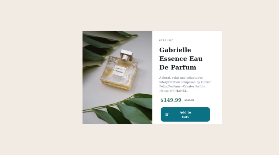
Design comparison
Community feedback
- @alvyynmPosted over 2 years ago
Hey Mohit, thanks for working on the challenge. Just a few notes for you.
Your code isn't responsive as required by the challenge. First, you're using a single image across all screen sizes. You need to use the desktop image (the one you're currently using) only on large screens, then a mobile image for smaller screens. Check out MDN's responsive image guide for more details.
Secondly, you'll need to use media queries to adjust the layout based on the agent screen.
Thirdly, your cart icon doesn't display on certain screen sizes. I would use a real
buttonelement:<div class="anchor"> <button class="cart-btn"><img src="images/icon-cart.svg" alt="cart icon" />. </span>Add to Cart</button> </div>and then style it as follows👇:
.cart-btn {
  width: 100%;
  height: 50px;
  background-color: hsl(158, 36%, 37%);
  border-radius: 5px;
  color: hsl(0, 0%, 100%);
  font-family: "Montserrat", sans-serif;
  font-weight: 700;
  border: 0;
}

.cart-btn > img {
  margin-right: 20px;
  vertical-align: sub;
}

.cart-btn:hover {
  background-color: hsl(156, 42%, 18%);
}
I hope this helps! Keep crushing 💪
0
Please log in to post a comment
Log in with GitHubJoin our Discord community
Join thousands of Frontend Mentor community members taking the challenges, sharing resources, helping each other, and chatting about all things front-end!
Join our Discord
