Solution retrospective
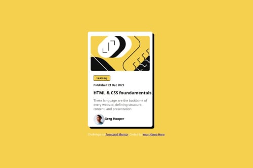
What I'm most proud of: "I'm most proud of how efficiently I was able to implement the design. I was able to stick closely to the provided layout while ensuring the code was clean and well-organized. I also feel good about how the final result is responsive and looks great on different screen sizes."
What I would do differently next time: "Next time, I would spend more time exploring different ways to enhance the user experience, such as adding subtle animations or refining some of the design elements. I would also focus on improving my workflow to speed up the development process even more."
What challenges did you encounter, and how did you overcome them?I found the challenge straightforward and didn't encounter any significant difficulties. The instructions were clear, and the design was easy to implement. Overall, it was a smooth experience, and I'm looking forward to more challenges like this!"
This communicates that you had no problems while still giving positive feedback.
What specific areas of your project would you like help with?How to use grid
Please log in to post a comment
Log in with GitHubCommunity feedback
No feedback yet. Be the first to give feedback on big boy's solution.
Join our Discord community
Join thousands of Frontend Mentor community members taking the challenges, sharing resources, helping each other, and chatting about all things front-end!
Join our Discord