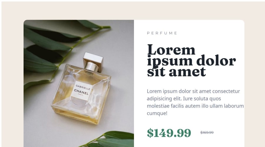
Design comparison
SolutionDesign
Solution retrospective
What are you most proud of, and what would you do differently next time?
hello
What challenges did you encounter, and how did you overcome them?hello
What specific areas of your project would you like help with?hello
Community feedback
- Account deleted
Hello @mvassari73, I have some suggestions that could help improve your project.
- To make it responsive, it's recommended that you add media queries to the design. You can use the
mobile-design.jpgimage to help. - Fix the width of the container to match the design. I recommend replacing
width: 1440pxwith600pxas it is the closest width to the design. - Replace
<div class="container">with themainelement. This helps to identify the main content of the page, which in this case is the content inside the card.
I hope you find these suggestions useful. Good luck on your next project!
0 - To make it responsive, it's recommended that you add media queries to the design. You can use the
- @SatyamMourya21062004Posted 12 months ago
done a great work but resize the image and block that's all
0
Please log in to post a comment
Log in with GitHubJoin our Discord community
Join thousands of Frontend Mentor community members taking the challenges, sharing resources, helping each other, and chatting about all things front-end!
Join our Discord
