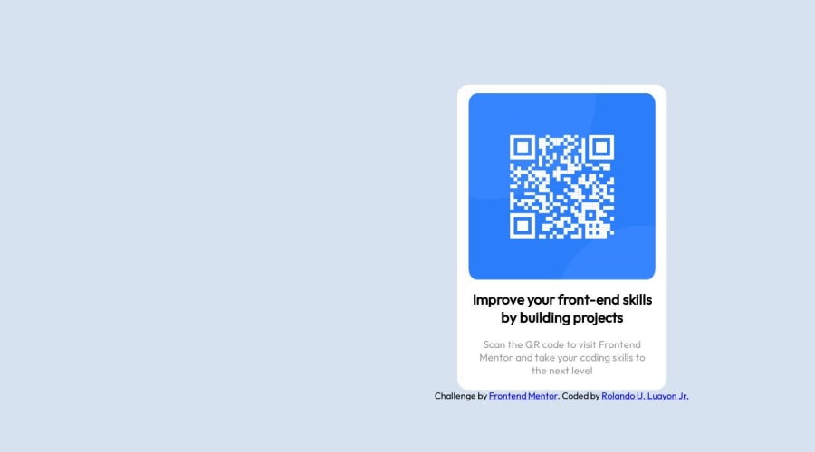
Design comparison
Solution retrospective
Feel free to comment I'm happy to read what mistakes I've done and just tell me what should i do next or tell me what should i study to develop my skills
Community feedback
- @JohanChereauPosted over 1 year ago
Hello @JayrQtt 👋
Well done on this challenge!
From my point of view, what I can advise you is :
- to avoid putting divs everywhere and instead use semantic tags. They are useful for giving more meaning to the content of your web page, so they offer better accessibility and better SEO. If you'd like to learn more, go here: MDN Documentation. Divs aren't forbidden at all, but you should try to use HTML semantics as much as possible. ;)
Here's an example with your code:
<body> <main> <div class="card"> <img src="image-qr-code.png" alt="Qr code"> <h1>Improve your front-end skills by building projects</h1> <p>Scan the QR code to visit Frontend Mentor and take your coding skills to the next level</p> </div> </main> </body>
You can also replace the
<div class="card"></div>
with the<article></article>
tag. If you use divs, try to give them explicit class names, as this will help you find your way around your code better, especially on larger projects!- Also, to center your elements horizontally and vertically, take a look at Flexbox or CSS Grid, they'll make life easier 😉.
As for CSS, I avoid, as far as possible, giving fixed widths and heights (in pixels in particular), whether for your card or your image. Even if, for the purposes of this challenge, there isn't much in the way of responsiveness to worry about, (apart from screens smaller than 375px), I'll give you a few tips that may come in handy in your future projects:
-
For example, for your card, you can block the width of your card with
max-width: 370px;
This means that it will stretch to 370px and won't go beyond that, so there's no need for width in this case. -
When it comes to images, we prefer to use percentages whenever possible, such as
width: 100%;
so that your image takes up the entire available size of your parent element.
Other small errors: for example, on line 14 you've opened an h2 and closed it with an h1, or on line 17 it looks as if there's a closing div tag that isn't open.
These are just a few tips that you can apply (depending on your projects) with practice, and this is only my point of view!
Please feel free to correct or add to my feedback.
Don't hesitate if you have any questions! Good luck and happy coding!
Marked as helpful0
Please log in to post a comment
Log in with GitHubJoin our Discord community
Join thousands of Frontend Mentor community members taking the challenges, sharing resources, helping each other, and chatting about all things front-end!
Join our Discord