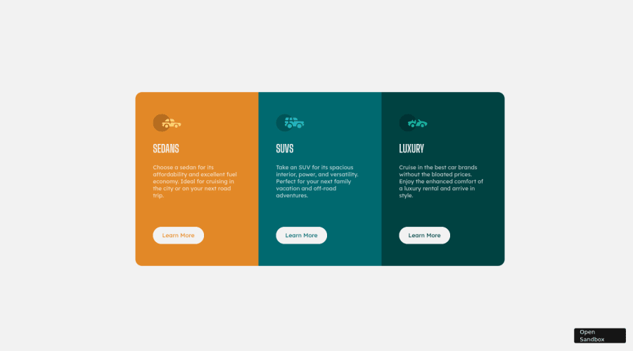
First time really trying to use @media queries
Design comparison
Solution retrospective
I did use the media queries, the site is being responsive to all sort of sizes on desktop, but it's not being responsive when it comes to mobile.
Could anyone read my code and tell me if I wrote something that is overriding the medias to mobile or anything else?
Community feedback
- @kens-visualsPosted about 3 years ago
Hey @wallysonruan 👋🏻
I've got some suggestions for the project.
- For the car icons, add
aria-hidden="true”
, because they are for decoration only. You can read more aboutaria-hidden
here. - Next, I suggest adding
transition: all 0.2s;
to the button and the links, this will make:hover
smoother. - Whenever you start a new project, you should always reset CSS, I won't go into details about resetting CSS, but I'll leave this cool article here, which will make more sense than my brief explanation.
- Also, I've made a couple of changes in
body
to get rid of vertical and horizontal scrolling. Here's the code:
body { min-height: 100vh; display: flex; align-items: center; background-color: var(---Very-Light-Gray); }
default width of
body
is100%
so no need to add100vw
because is causes side scrolling. I changedheight: 100vh;
tomin-height: 100vh;
because it's more responsive.- Lastly, those accessibility and HTML issues are perhaps coming from the sandbox button.
I hope this was helpful 👨🏻💻 to answer your question, I'd suggest learning mobile first approach, in that case you will know for sure if you are overwriting any styles, and it makes putting layouts together a lot faster and easier. Other than that, nicely done, you did a good job, keep it up. Cheers 👾
Marked as helpful0@wallysonruanPosted about 3 years agoHi, @kens-visuals !
First I'd like to thank you for kindly taking some o' your time to give me all these tips. I'll surely study them all, specially the MOBILE-FIRST approach.
I didn't know about that "min-height" property, thanks for that. The scroll was always pissing me off... Gonna start to use that.
The HTML issues are not my fault here, that's from the sandbox – I don't even know how to write in JS yet LOL.
Now I'mma read the articles you linked here, hopefully I'll be using them on my next challenge.
0@kens-visualsPosted about 3 years agoHey @wallysonruan, you're welcome, I'm glad I could be helpful 😇 You can just write the code locally on your machine, then push it GitHub and host it with GitHub pages. That way, even if you had some accessibility or HTML issues, you'd be able to fix them.
0 - For the car icons, add
Please log in to post a comment
Log in with GitHubJoin our Discord community
Join thousands of Frontend Mentor community members taking the challenges, sharing resources, helping each other, and chatting about all things front-end!
Join our Discord