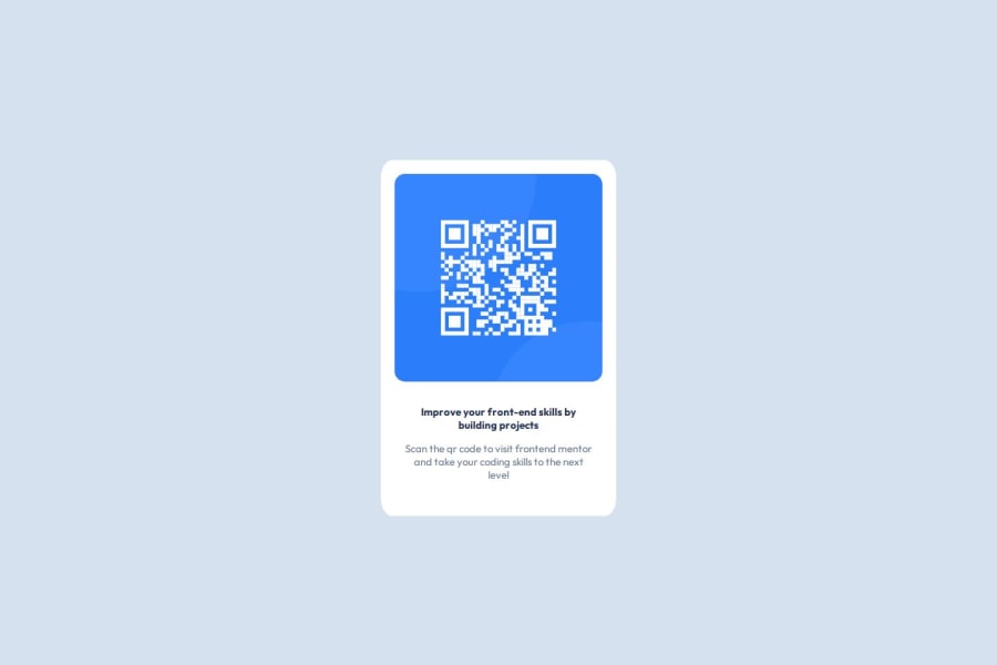
Design comparison
Solution retrospective
This is the first time I felt like I understood flex. I understood that I needed to flex with flex-direction column.
I don't really understand what the best way to set the width is. Also the example said that the desktop and mobile widths were different but they seemed similar to me. I ended up using a max-width, but I imagine this is not correct.
There were many aspects I simply guessed on like the border radius.
What challenges did you encounter, and how did you overcome them?It took me while to understand flex. And It took me a while to understand that the styling sometimes goes into the parent and not the child.
I struggled to see why div surrounding the image had some extra padding around the image. The reason turned out to be the paragraph element beneath the image was expanding to as much space as possible.
What specific areas of your project would you like help with?I would like to know if my general use of flex was correct, and how to think about things like max-width of if there is a better way.
Please log in to post a comment
Log in with GitHubCommunity feedback
- @MohammedOnGit
Hello JacksonRudd!!!
Your HTML structure looks good and well-organized. Here are a few recommendations to improve accessibility and structure for readability
- Semantic Elements: Use
<main>and<section>tags to define content areas. Using<main>and<section>improves structure and helps screen readers. - Headings: Replace the first
<p class="bold">with a heading tag like<h1>for better readability and accessibility.
You did great. Keep it up!!!
Marked as helpful - Semantic Elements: Use
Join our Discord community
Join thousands of Frontend Mentor community members taking the challenges, sharing resources, helping each other, and chatting about all things front-end!
Join our Discord
