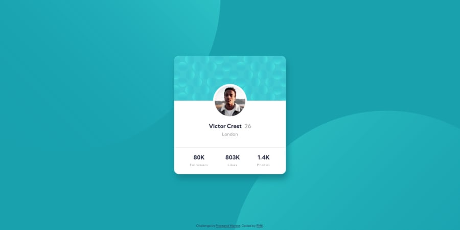
Design comparison
Solution retrospective
Happy to finally submit my first solution! Would appreciate any feedback at all, but particularly on:
- mobile landscape view; currently there is vertical scroll, which I think is better than being only partly visible - but I'm not sure how to avoid both?
- accessibility
- is there a better way to position the profile image - is use of negative margins acceptable?
Community feedback
- @grace-snowPosted about 4 years ago
Hi
I think the solution looks excellent. Positioning is all fine (I'm viewing on mobile) and vertical scroll is a good thing.
Where the accessibility falls down a little is in the html markup, so here are some suggestions
- on the background image pattern, the empty alt is good, but also add in
aria-hidden="true"on this one as Apple voiceover will still announce the image if it is an svg - the city probably isn't a h2. What is London a heading for? I'd make that a paragraph.
- the stats at the bottom definitely don't make sense as h3s and paragraphs. Think about what that content is. The number doesn't make sense without the word. So you could put each pair in a list item or paragraph and use spans inside that for the styling, or use a description list element, or even a table (with the words as ths and the numbers as tds)
Hopefully that helps.
2@grace-snowPosted about 4 years agoUsing nagative margins is fine by the way. Alternative could be a transform. That would be preferable if it was an animation as transforms don't trigger a repaint/reflow, but for static stuff like this a negative margin is fine to use
1@grace-snowPosted about 4 years agoJust a general suggestion: rather than repeating 3 classes one for each state, why not just use one class and place that on all 3 in the html?
stat-social-followers, .stat-social-likes, .stat-social-photos {1@RMK-creativePosted about 4 years ago@grace-snow thank you for the detail feedback and suggestions! I've now included aria-hidden, and read up about ARIA in general as I hadn't come across it before. I've also changed the h2 and h3s, and used li for the stats - I think I was using them as a means for sizing, so thanks for highlighting that, definitely a bad habit I need to lose! Not sure what I was thinking with those three separate classes - I've updated this also.. I clearly need to slow down and be more mindful with HTML! Your feedback has been incredibly valuable, thanks again :)
0 - on the background image pattern, the empty alt is good, but also add in
- @gabrielpotonPosted about 4 years ago
This comment was deleted about 4 years ago
2@RMK-creativePosted about 4 years ago@gabrielpoton thank you for your feedback :) I tried adding 100vh but it didn't seem to change anything in this case - I'm much less worried about it now as the scrolling seems to be acceptable. I guess if the content were to fit perfectly on landscape for smaller screens it would be really difficult to read! So it makes sense in this way to me now. I will definitely use transform in future - thanks for that tip, I appreciate it!
1 - @fraserwatPosted about 4 years ago
Looks great, I've tried on a few different dimension presets in chrome and translates perfectly to mobile (background and all!). One thing I'd maybe change is the positioning of the .attribution class. You can use the
bottomattribute along with margin and padding to position it closer to the footer.1@RMK-creativePosted about 4 years ago@fraserwat I implemented your suggestion and now it looks much cleaner. Cheers! :)
0 - @mbart13Posted about 4 years ago
if think Grace meant something like this, where each stat is a list item
<ul>
    <li></li>
    <li></li>
    <li></li>
</ul>
you created
ulfor every stats item and I'm not sure it's correct, but I could be wrong ;p0@RMK-creativePosted about 4 years ago@mbart13 Oh you could be right.. I hadn't thought to do it that way. I downloaded a screen reader extension to see how it would be read out, and with the current structure it worked well. Do you think there's any benefit to changing it as you suggest?
0
Please log in to post a comment
Log in with GitHubJoin our Discord community
Join thousands of Frontend Mentor community members taking the challenges, sharing resources, helping each other, and chatting about all things front-end!
Join our Discord
