Not Found
Not Found
Not Found
Not Found
Not Found
Not Found
Not Found
Not Found
Not Found
Not Found
Not Found
Not Found
Not Found
Not Found
Not Found
Not Found
Not Found
Not Found
Not Found
Not Found

Submitted

First solution submit on FEM. Used HTML, CSS and JS.

@RikvanderSar

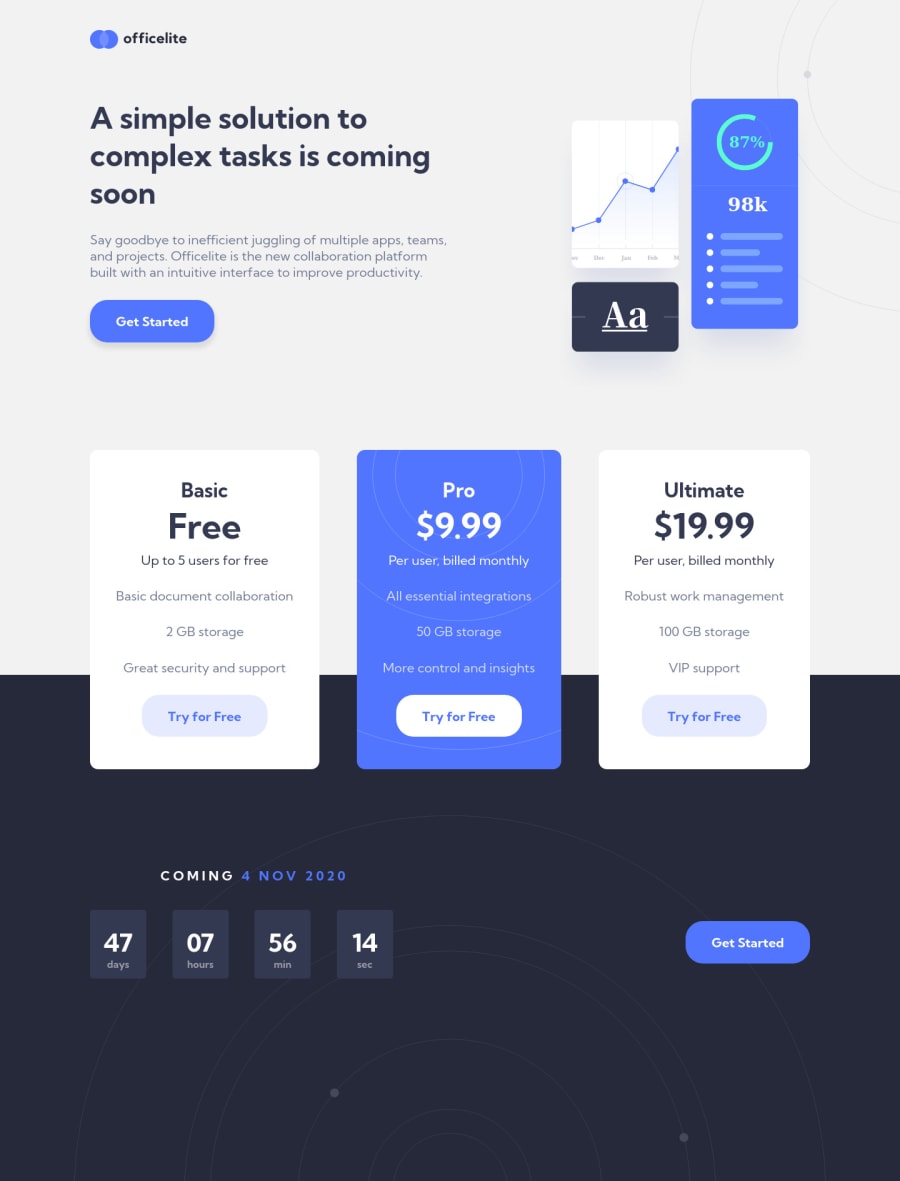
Desktop design screenshot for the Officelite coming soon site coding challenge

This is a solution for...

  • HTML
  • CSS
  • JS
2junior
View challenge

Design comparison


SolutionDesign

Solution retrospective


Some tips and suggestions to further style the form elements would be great. I'd also would appreciate feedback on the readability of the code.

Community feedback

T
Matt Studdert 13,611

@mattstuddert

Posted

Hi Rik, first of all, congrats on submitting your first solution! 🎊

I hope you enjoyed building the project and learned some new things along the way. You've done an excellent job. Here are some thoughts after taking a look at your solution:

  • First up, from a codebase/project architecture perspective, I'd recommend cleaning up your file and folder structure. You've still got a /starter-code folder in there, which doesn't seem to be getting used, and all your assets are at the root level of your project. To clean things up, you could put them in an /assets folder.
  • It's great to read through your README.md file and learn more about your process and the time it took you to complete the project. Journaling your process will be a great help as you progress. Nice to see you mention client-side validation in your "Continued Development" section as well because that's something I was going to point out. Using the built-in HTML5 validations is great, but you'll often need custom client-side validation based on the design. So it's well worth practising early on.
  • You're linking to separate CSS files on your two pages. It's best to keep it to a single CSS file and link to that on both pages. That way, you can reuse styles between pages and not duplicate code unnecessarily.
  • For your HTML, be sure to really think through what element makes the most sense semantically in a given situation. For example, you're currently using paragraphs for the lists of features in the pricing components when an unordered list would make more sense.
  • The homepage's responsiveness isn't quite right at the moment, as the content overlaps between sections.
  • The overall layout of your pages look good, but there are slight differences between your solution and the design. Spending some time working through these visual differences and bringing the solution a bit closer would be time well spent.
  • Your form styling looks fine! Styling things like select boxes isn't overly necessary, especially at this point. You can always come back to that at a future date.

I hope these pointers help. Let me know if you have any questions! 🙂

Marked as helpful

1

@RikvanderSar

Posted

@mattstuddert I've updates the project with your feedback!

0

@RikvanderSar

Posted

Hi Matt,

Thank you for this helpfull feedback, really appreciate it! I'm definitly learning a lot from this project.

I'll get back at it with your feedback and will post a update soon!

0

Please log in to post a comment

Log in with GitHub
Discord logo

Join our Discord community

Join thousands of Frontend Mentor community members taking the challenges, sharing resources, helping each other, and chatting about all things front-end!

Join our Discord