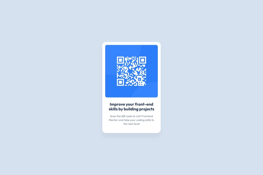
First solution of a QR Code component with HTML and CSS
Design comparison
Solution retrospective
I didn't knew much about HTML and CSS and never did a project from zero, this helped me in creating it for the first time.
Didn't knew much about git too, how to create repositories and git commands lessons helped me on learning how to work on an IT enviroment. I hope to develop my knowledge further.
Community feedback
- @BrianMunizSilveiraPosted about 19 hours ago
Feedback for QR Code Challenge by "massiro"
Your solution to the QR Code challenge looks clean and functional. Below are some recommendations to help refine your project and improve both functionality and aesthetics. Great work so far!
Strengths
- Clean Layout
- The structure is straightforward and the use of a centered
.wrapperensures focus on the content.
- The structure is straightforward and the use of a centered
- Semantic Use of HTML
- The usage of
h2for the heading andpfor the description is semantically correct.
- The usage of
- Consistent Styling
- The white card with a shadow effect and rounded corners creates a modern, clean look.
Suggestions for Improvement
1. Accessibility Improvements
- Add a descriptive
altattribute to the QR Code image. This is important for screen readers and users who rely on assistive technologies:
<img src="images/image-qr-code.png" alt="QR Code linking to the Frontend Mentor website">2. Typography Adjustments
- Use line-height to improve text readability, especially for longer paragraphs:
.wrapper p { line-height: 1.5; /* Improves readability */ }- Add consistent spacing around the heading (
h2) and ensure text-align consistency:
.wrapper h2 {
    text-align: center; /* Center aligns the heading */
    line-height: 1.3; /* Enhances readability */
}
3. Responsiveness Enhancements
- The fixed height (
height: 499px) on.wrappermay cause layout issues on smaller screens. Consider using min-height instead:
.attribution {
    margin-top: 20px;
    font-size: 11px;
}
4. Footer Positioning
The footer (
.attribution) appears far from the main content. You can useposition: relativeorpaddingadjustments to make it more visually connected:.attribution { margin-top: 20px; font-size: 11px; }5. Additional Aesthetic Enhancements
Add hover effects to make your card more interactive, like a subtle shadow on hover:
.wrapper:hover {
    box-shadow: 0 8px 20px rgba(0, 0, 0, 0.2);
    transition: box-shadow 0.3s ease-in-out;
}
Summary
Your project is already in great shape! With small improvements like responsive image adjustments, better typographic hierarchy, and accessibility refinements, it can look even more polished.
Keep practicing and experimenting with new ideas. You’re doing amazing! 🚀
1 - Clean Layout
Please log in to post a comment
Log in with GitHubJoin our Discord community
Join thousands of Frontend Mentor community members taking the challenges, sharing resources, helping each other, and chatting about all things front-end!
Join our Discord
