Submitted over 2 years ago
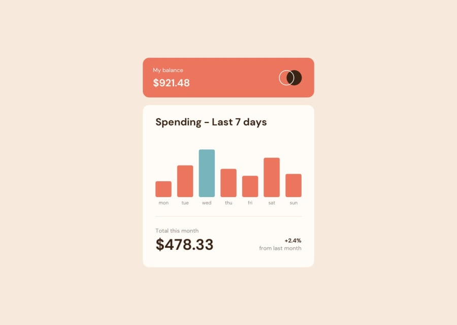
First Solution - expenses chart component
@AdemolaSam
Design comparison
SolutionDesign
Solution retrospective
Hi, your thoughts, ratings, corrections and tips on best practices and responsiveness is welcome. tnks.
Community feedback
- @coding-tomatoPosted over 2 years ago
Hello!
Seems like reducing the height of the site breaks the component, I'd add a minimum height for both the spending section and the header.
Also, the component doesn't seem width responsive, maybe you could add it? Something like clamp: (375px, 100%, 450px).
Very good work!
Marked as helpful1@AdemolaSamPosted over 2 years ago@coding-tomato Thanks, I will give it a try.
0
Please log in to post a comment
Log in with GitHubJoin our Discord community
Join thousands of Frontend Mentor community members taking the challenges, sharing resources, helping each other, and chatting about all things front-end!
Join our Discord
