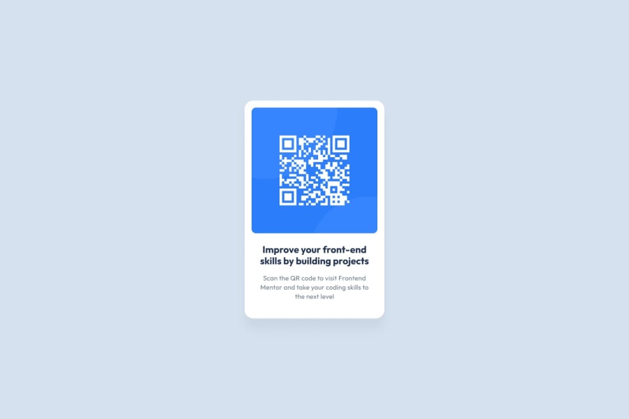
Design comparison
Solution retrospective
Not much, i never really been good at frontend so i want to improve, this challenge was a good refresher of flexbox.
What challenges did you encounter, and how did you overcome them?I couldn't get the text title to look exactly like in the reference pictures. For example, in the picture, it looks more bold. Also, I couldn't make the width or spacing of the two rows of the title text look the way I wanted to.
appreciate the help
What specific areas of your project would you like help with?I would appreciate advice on how to approach upcoming challenges, and how to fix the problem i mention above about the text.
Community feedback
- @camillecataPosted 7 months ago
- Does the solution include semantic HTML?
Yes, this person has used main and p tags which help define the meaning of the content they contain.
-
Is it accessible, and what improvements could be made? The image contains an alt description which increases its accessibility, you could describe the QR code's purpose or content, not just its name, to provide better context to screen reader users. Adding some nav landmarks for each component in the code such as <section> for text-container. The "attribution" text could also be a <footer> or a <small>.
-
Does the layout look good on a range of screen sizes? Using the inspector tool on Chrome, i can confirm that the layout looks good and keeps its integrity on a wide range of screen sizes. When playing around with the responsive option, the QR image stays integral but the text does not stay in place
-
Is the code well-structured, readable, and reusable? Code is readable, indented. Having an external stylesheet (styles.css) is a good practice, which enhances reusability and maintainability. For a larger project, you could be build separate sections like the QR code, attribution, etc., to improve reusability. You can read about reusable components to see how this works in practice.
-
Does the solution differ considerably from the design? The solution is very close to the original design. I suggest adding a font weight of 400 to the p element, as well as some padding or margin of 10px
0
Please log in to post a comment
Log in with GitHubJoin our Discord community
Join thousands of Frontend Mentor community members taking the challenges, sharing resources, helping each other, and chatting about all things front-end!
Join our Discord
