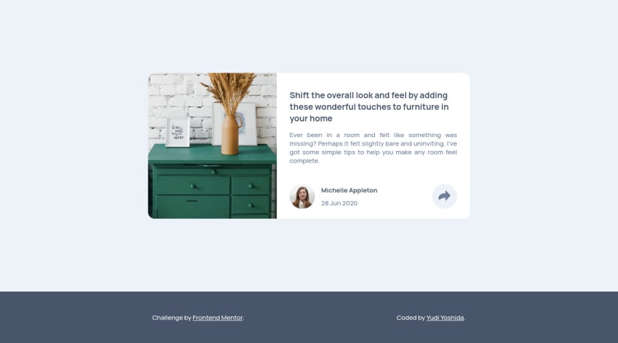
Design comparison
Solution retrospective
Hello, front-end developers! How are you?
So, this is my first project trying to use BEM methodology, I would really apreciate if you guys give some feedback if I did something wrong or anything that I can improve.
Besides that, this project was really fun! I learned a lot about how to use grid-template-areas and pseudo-elements (::after) to create an arrow to my "tooltip" social media.
Thank you! Keep coding!!
Community feedback
- @ApplePieGiraffePosted over 3 years ago
Greetings, Yudi Yoshida! 👋
Nice to see you complete another challenge! 😀 Good job on this one! 👏 I think your code looks pretty good so does your solution! It's nice to hear that you learned some new things while completing this challenge, as well! 😆
One thing I'd like to suggest is to make the popup keyboard-accessible. It would be worth using a
<button>element for the social media popup button (since that's what that element is) and perhaps adding anaria-labelto it or something to identify it. 😉Keep coding (and happy coding, too)! 😁
Marked as helpful1@yudiyoshidaPosted over 3 years agoHey, @ApplePieGiraffe, how are you?
Thank you for you feedback, I had no idea about the aria-label attribute. I will update my solution with your suggestions!
Keep coding too!
1@ApplePieGiraffePosted over 3 years ago@yudiyoshida
I'm doing good, Yudi! 👍 I hope you are, too! 😆
Glad to help! 😀
0 - @FocusCookiePosted over 3 years ago
Very nice solution and the js part is very small too! Nice job!
0
Please log in to post a comment
Log in with GitHubJoin our Discord community
Join thousands of Frontend Mentor community members taking the challenges, sharing resources, helping each other, and chatting about all things front-end!
Join our Discord
