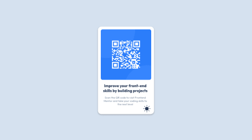
Design comparison
Solution retrospective
What did you find difficult while building the project?
Hi guys, this is my first project on Frontend Mentor! I've stopped and started a few Udemy classes and decided to jump into developing projects instead - I soon realised that I was attempting to memorise everything and nothing was sticking. The same applies to the limited amount of Javascript I learnt.
-
I actually found uploading the project to GitHub quite difficult initially, so if anyone has tips on that it would be great!
-
I wasn't entirely sure how to best make the design responsive
-
I also attempted to create a light and dark mode but realised I was out of my depth haha. If anyone has any tips for this I would be great!
-
Also, I would appreciate it if you have any tips for the HTML semantics! Thank you for all of your help. Much love ❤️
Community feedback
- @0xabdulkhaliqPosted over 1 year ago
Hello there 👋. Congratulations on successfully completing the challenge! 🎉
- I have other recommendations regarding your code that I believe will be of great interest to you.
CSS 🎨:
- Looks like the component has not been centered properly. So let me explain, How you can easily center the component without using
margin
orpadding
.
- We don't need to use
margin
andpadding
to center the component both horizontally & vertically. Because usingmargin
orpadding
will not dynamical centers our component at all states
- To properly center the component in the page, you should use
Flexbox
orGrid
layout. You can read more about centering in CSS here 📚.
- For this demonstration we use css
Grid
to center the component
body { min-height: 100vh; display: grid; place-items: center; }
- Now remove these styles, after removing you can able to see the changes
body { margin: 9.5rem auto; } .card-wrapper { margin: auto; }
- Now your component has been properly centered
.
I hope you find this helpful 😄 Above all, the solution you submitted is great !
Happy coding!
0 - @adriananinPosted over 1 year ago
For the HTML semantics you can use this to check : https://validator.w3.org/
0 - @BernardusPHPosted over 1 year ago
Hello MATTFORRESTER39.
For design responsive I see that your
<div id="qr-code-container">
is set to 18 rem so that is breaking your card when you resize because the card might get smaller but not the image itself because it is set at 100% width. But since it reached the min of375 px
screen size and is fine then nothing is wrong but I would rather put the<div id="qr-code-container">
at 100% width width a bit of padding on the parent.Don't use
height:100vh
on the body rather use min-height:100vh and min-height:100dvh the min-height makes your body's height as big as the screen but it can then increase based on the content. The dvh is for more responsiveness but put the vh before this as some browsers cant read dvh.body{ min-height:100vh; min-height:100dvh; }
The dark theme was a nice touch I like it.
Yes github was quite difficult starting out. I would recommend just manually putting the files in the github repo and then launching it from pages. If you get used to it then I would highly recommend learning Git as it can make editing and storing your projects on github much easier.
Hope this helped.
0
Please log in to post a comment
Log in with GitHubJoin our Discord community
Join thousands of Frontend Mentor community members taking the challenges, sharing resources, helping each other, and chatting about all things front-end!
Join our Discord