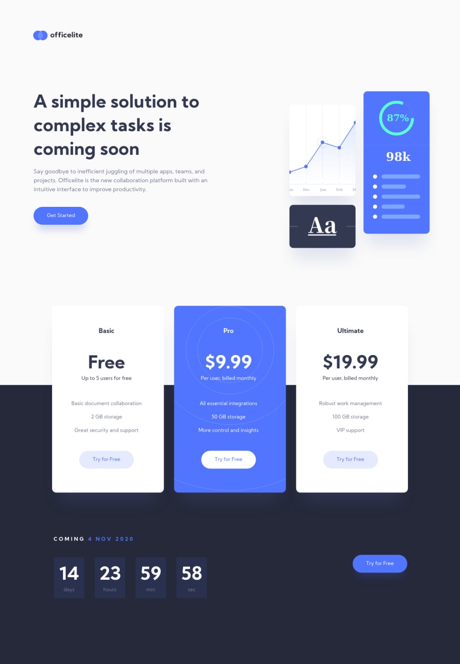
Design comparison
Solution retrospective
I kept running into issues with the addition of both backgrounds so if anyone knows a solution that would be great.
The hardest part about this was when I changed a 'component' on desktop resolution, it would then change it on mobile as well.
I managed to fix it in the end but I know for a fact my code structure is garbage so any help with that would be appreciated too. :)
Community feedback
- @AgataLiberskaPosted over 3 years ago
Hi @deanhopes :) I personally added the backgrounds as background images to pseudo elements, and changed the background-size, position and display depending on viewport-size, but there may be a better solution.
More importantly though, I can see on github that you've done both pages, but I can only view one :) the 'Get started' buttons on the main page should really be anchor tags linking to your signup page :)
Hope this helps!
1@deanhopesPosted over 3 years ago@AgataLiberska Thank you. I missed that. I'm going to practice on a few other easier ones and come back to this :)
0
Please log in to post a comment
Log in with GitHubJoin our Discord community
Join thousands of Frontend Mentor community members taking the challenges, sharing resources, helping each other, and chatting about all things front-end!
Join our Discord
