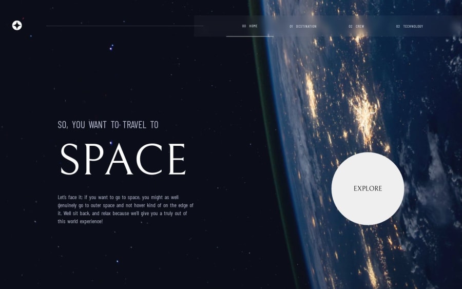
Design comparison
Solution retrospective
This is the first page I do with react was a good challenge but there are things that I do not know if it is quite right as would be to use a function with a state to measure the width of the screen to switch between one image or another among other doubts
Community feedback
- @ifarontiPosted about 1 year ago
If you are talking about the background-Images or <img/> :
in CSS, use background-image: url(location of image) then in your media query (e.g @media only screen and (max-width: 375px){}), change the image location.
If you are using inline CSS or using <img/>, declare a variable in state(e.g large) whose value depends on screen size so when you are choosing the location of the image, use ternary like this: (directory/{large > 500 ? 'largeImage.jpg' : 'small.jpg'}) or <img src={directory/{large > 500 ? 'large.jpg' : 'small.jpg'}} alt=''" /> That will automatically tell the browser which image to choose depending on screen size.
Also, use useEffect to make it responsive
React.useEffect(()=>{ setLarge(window.innerwidth) }, [window.innerWidth])
Marked as helpful0
Please log in to post a comment
Log in with GitHubJoin our Discord community
Join thousands of Frontend Mentor community members taking the challenges, sharing resources, helping each other, and chatting about all things front-end!
Join our Discord
