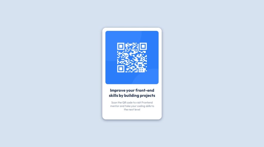
First Newbie Challenge With HTML and CSS Only. Desktop First Approach.


Design comparison

Solution retrospective
This was the first Challenge I ever completed on my own.
I most proud of setting up my machine, connecting to and working with GitHub and managing to complete the task set without a tutorial or direct help.
What challenges did you encounter, and how did you overcome them?The most difficult part was understanding how to use the :root functionality as to avoid having to write out the color codes each time. I found an article on freeCodeCamp where someone had the same issue/question which helped me better understand and adjust my code.
Next the "card" seemed to have a shadow on the bottom border which I had difficulty re creating. I used a combination of the MDN explanations of box-shadow and trial and error to reach a solution that seemed to look good.
What specific areas of your project would you like help with?I still struggle to fully understand how to use box-shadow. In my solution I used the syntax:
box-shadow: 0px 4px 16px 0.1px var(--project-grayishblue);
While I understand that the first two inputs move the shadow on the x/y axis, the third and fourth input I don't fully understand.
I would have liked to adjust the shadow so that there is less on the sides and the opacity is even lower so that the shadow would be more subtle.
In the attempted solution I did not access the Figma files.
Community feedback
Please log in to post a comment
Log in with GitHub
Join our Discord community
Join thousands of Frontend Mentor community members taking the challenges, sharing resources, helping each other, and chatting about all things front-end!
Join our Discord