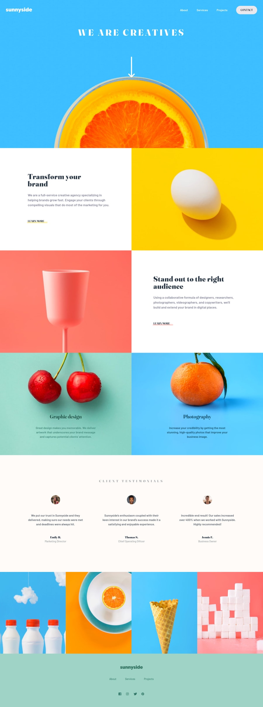
First landing page using CSS grid and flexbox
Design comparison
Solution retrospective
Let me know what you guys think about use of custom properties and how I handled the responsive part of the challenge!
Would you approach any of the sections in a different way? What was your solution for the mobile-nav "triangle"?
Cheers :)
Community feedback
- @DavidMorgadePosted over 2 years ago
Hey congratulations on finishing the challenge!.
About the use of custom properties, they are one of the best features that CSS has, I used them even when using SASS variables because they are easy to manipulate (for example for a light and dark mode of an App), an I would definitely use it for sizes too, also they are great when you want to change your project colors, because you can change them and they will apply to all the elements that are using that property.
The responsive looks great for me, the transition between desktop and mobile goes well!
Hope my feedback helps you!
Marked as helpful1
Please log in to post a comment
Log in with GitHubJoin our Discord community
Join thousands of Frontend Mentor community members taking the challenges, sharing resources, helping each other, and chatting about all things front-end!
Join our Discord
