Not Found
Not Found
Not Found
Not Found
Not Found
Not Found
Not Found
Not Found
Not Found
Not Found
Not Found
Not Found
Not Found
Not Found
Not Found
Not Found
Not Found
Not Found
Not Found
Not Found

Submitted

First landing page (seeking revision)

Connor Allenā€¢ 210

@ThePartnerDeveloper


Design comparison


SolutionDesign

Solution retrospective


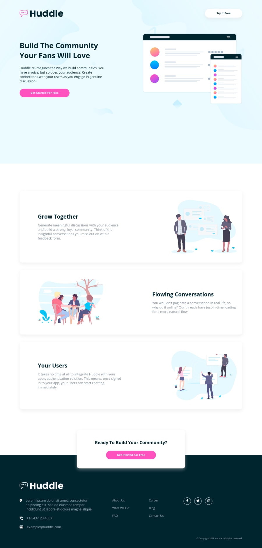
I had difficulty with the images, specifically the SVGs. I couldn't change the fill color of the SVG with classes without doing an inline SVG. Can someone help me figure out how to use object or an element like that to be able to change an SVGs fill color?

I know the responsiveness isn't the best but for this practice I was more focused on playing with the SVGs, background images, and shadows.

Community feedback

Vanza Setiaā€¢ 27,795

@vanzasetia

Posted

Hi, Connor Allen! šŸ‘‹

Use inline SVG and then on the CSS use fill property. This is something that you already did. So, nothing needs to be changed. šŸ™‚

I recommend prioritizing the responsiveness of the site than the box-shadow and other decorative things. It's okay if you don't get the box-shadow right. It's hard to know the value for the box-shadow without a design file.

When I was a free member, I would not worry too much about it. I would focus on the accessibility and responsiveness of the site and the code quality. These things are more important than getting the box shadow right.

Some suggestions from me.

  • Each of the social media icons should be wrapped by an anchor tag. Those are links. Why do you think those elements are buttons?
  • It is not a best practice to have many h1 on a page. It can confuse the screenreader users because there will be many titles for a single page. I recommend reading the "How-to: Accessible heading structure - The A11Y Project" article to learn how to use headings correctly.
  • For images that are used only as decorations (they do not give users any information and serve only an aesthetic purpose), the alt tag should still exist but should be left empty: alt="". This will tell the screen reader to simply skip over the image.
  • I highly recommend writing the styling using the mobile-first approach. It often leads to shorter and better performance code. Also, mobile users won't be required to process all of the desktop styles.

Lastly, I recommend visiting the Solid Start website. It gives you an overview of web accessibility.

I hope this helps! Happy coding!

Marked as helpful

1

Connor Allenā€¢ 210

@ThePartnerDeveloper

Posted

@vanzasetia Thank you so much for helping! I will study up on the recommended websites and try to improve the use of my heading tags along with learning more about accessibility to screen reader. I've heard about using the mobile-first approach, but I'm starting with desktop first to get the CSS fundamentals down, then I will transition into that to reduce having to override styles that have already been made.

1

Please log in to post a comment

Log in with GitHub
Discord logo

Join our Discord community

Join thousands of Frontend Mentor community members taking the challenges, sharing resources, helping each other, and chatting about all things front-end!

Join our Discord