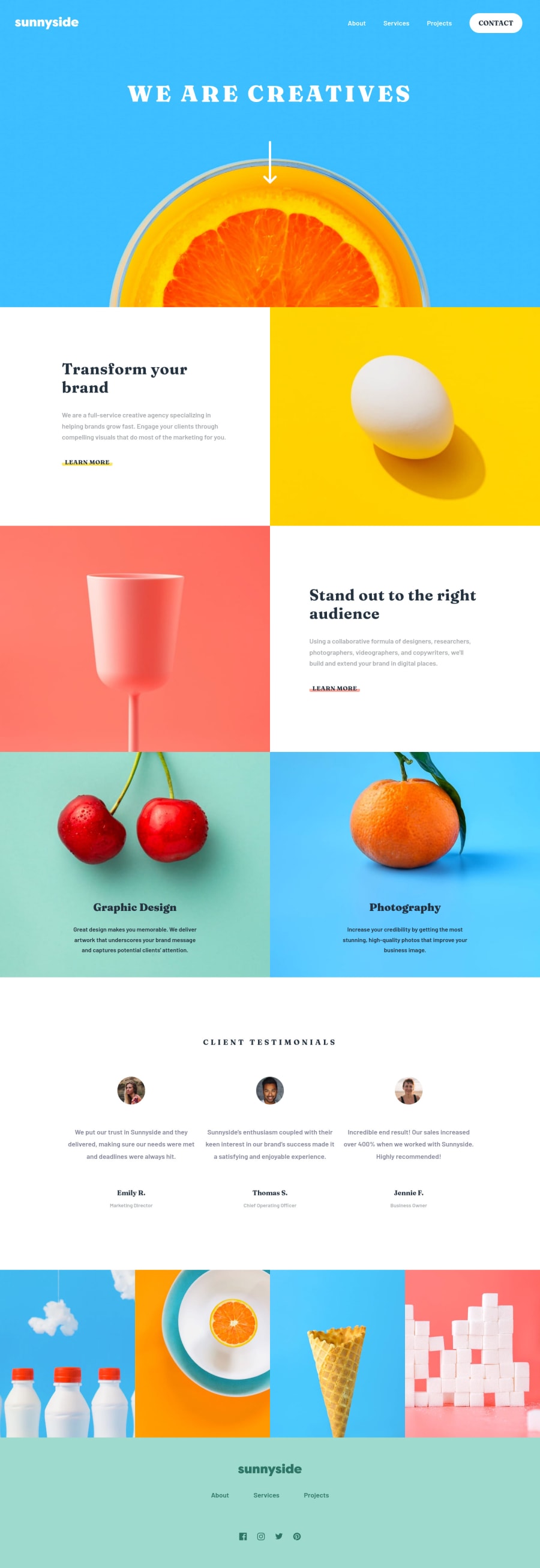
First Landing Page, Mobile first Workflow, CSS Grid, CSS Flexbox
Design comparison
Solution retrospective
I have finished my first landing page challenge. Every feedback will be very appreciate, especially for code optimization. Thanks
Community feedback
- @TalhaAmjad0034Posted over 3 years ago
Damn looks perfect to me!! Change icon to hamburger menu to cross or close on click... Keep going!! Great work
0 - @ApplePieGiraffePosted over 3 years ago
Greetings, Gilang Aditya! 👋
Nice job on this challenge! 👏 Your solution looks good and scales up/down very well! 😀
The only minor thing I suggest is to perhaps add a "close" icon for the mobile menu that gets displayed when the menu is open (since currently, the icon for the mobile menu simply remains the same). 😉
Keep coding (and happy coding, too)! 😁
0@madegilangadityaPosted over 3 years ago@ApplePieGiraffe thanks man, will do the close icon on menu
0 - @remarkovic98Posted over 3 years ago
Pretty cool :) Just keep working
0
Please log in to post a comment
Log in with GitHubJoin our Discord community
Join thousands of Frontend Mentor community members taking the challenges, sharing resources, helping each other, and chatting about all things front-end!
Join our Discord
