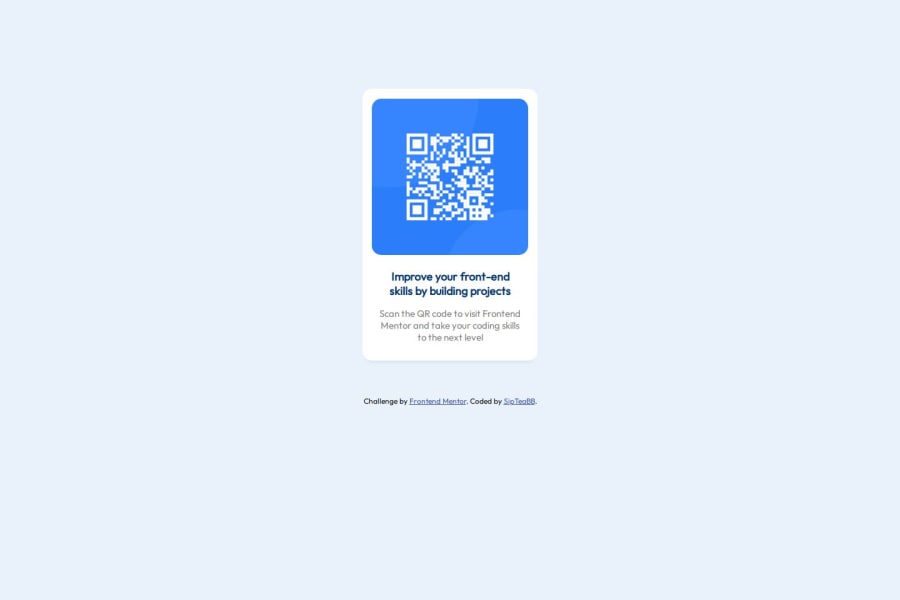
Design comparison
SolutionDesign
Solution retrospective
What are you most proud of, and what would you do differently next time?
I'm most proud of how close I feel that I've gotten to the preview image provided!
If I could, I would take more time to add notes to my project for personal future reference.
What challenges did you encounter, and how did you overcome them?I found adding custom text for the first time challenging.
I learned to add custom text to my files by googling. These resources helped a lot:
What specific areas of your project would you like help with?Any advice on organization of my css file in particular and any advice on best practices for comments would be appreciated.
Thank you!
Community feedback
Please log in to post a comment
Log in with GitHubJoin our Discord community
Join thousands of Frontend Mentor community members taking the challenges, sharing resources, helping each other, and chatting about all things front-end!
Join our Discord
