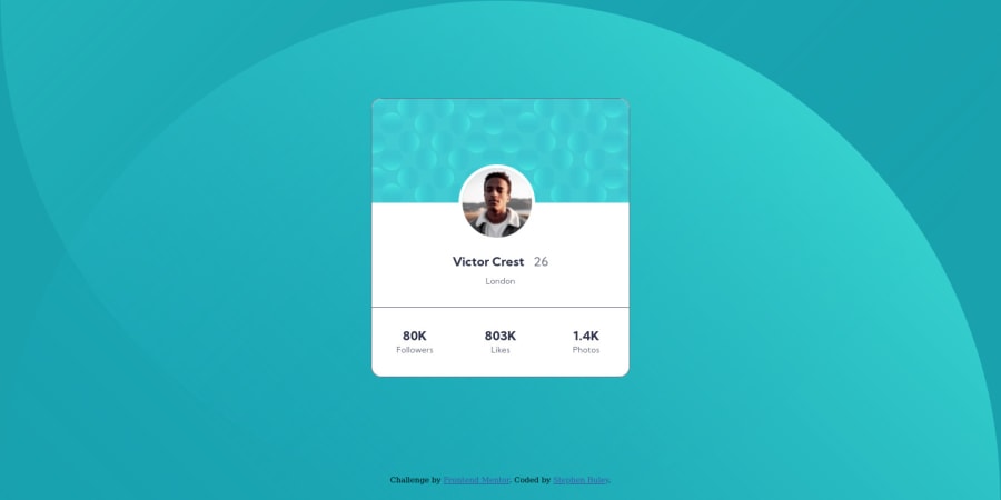
First go using only HTML and CSS - Profile Card Component
Design comparison
Solution retrospective
Mostly responsive, I know this isn't a huge page.
Can't for the life of me figure out the two background images to look like the design, other than that just general tips and fixes to help make my code more readable/efficient! Thanks!
Community feedback
- @soodaayushPosted almost 4 years ago
The way to position those 2 background images were to say background-position: top right, bottom left;
Happy Coding!
0@StephenBuleyPosted almost 4 years agoWarBaddy, I tried that and still end up with something different than the design... does it have something to do with the background-size property? It just doesn't look right.
Right now the solution is background-size: cover, but I've also tried contain, auto, different percent values, nothing seems to just put one in the bottom right and one in the top left.
0
Please log in to post a comment
Log in with GitHubJoin our Discord community
Join thousands of Frontend Mentor community members taking the challenges, sharing resources, helping each other, and chatting about all things front-end!
Join our Discord
