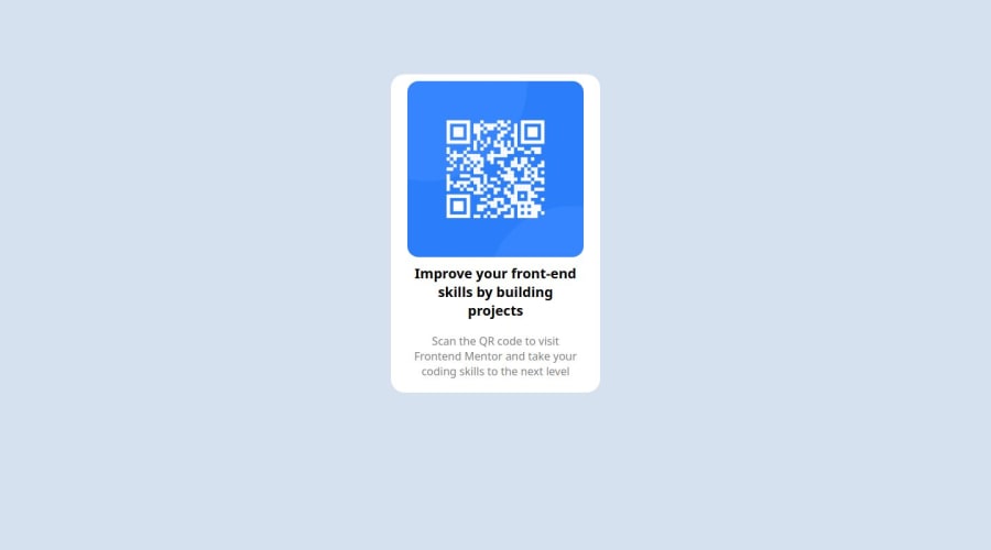
Design comparison
Solution retrospective
Proud that I got it to work. Good first dip into web developmment
What challenges did you encounter, and how did you overcome them?Still learning how to use git and vscode properly. Needed to look at other solutions to learn how to better use html and css. Need a better understanding of how css styling works.
What specific areas of your project would you like help with?It wasn't too big a project, so nothing I need help with right now. Will figure out how to solve the challenges I brought up as they become more relevant for more complicated things.
Community feedback
- @rowanDeveloperPosted 12 months ago
Hi @jreitman007! Congrats on finishing your first challenge! Keep the hard work! I really like your final solution. It is pretty similar to the original design.
There are a couple of things that you can improve on:
-
Try and have a habit on separating your style sheet with your HTML. It is a good practice to have all your styling in a separate style sheet. Also, you can apply a body background-color with the body element and having the background-color property.
-
Try using classes with your HTML tags. With that you can easily manipulate the styles of your HTML elements and organize your workflow with bigger projects.
-
I will recommend having a "main" div that wraps all your code. By having a main div (div class="main") or a div container you can position better the content within the screen by applying a margin: auto in it, for example.
Anyhow: congrats on finishing your challenge! And I hope you can continue on learning and improving on your FrontEnd skills!
Marked as helpful1 -
Please log in to post a comment
Log in with GitHubJoin our Discord community
Join thousands of Frontend Mentor community members taking the challenges, sharing resources, helping each other, and chatting about all things front-end!
Join our Discord
