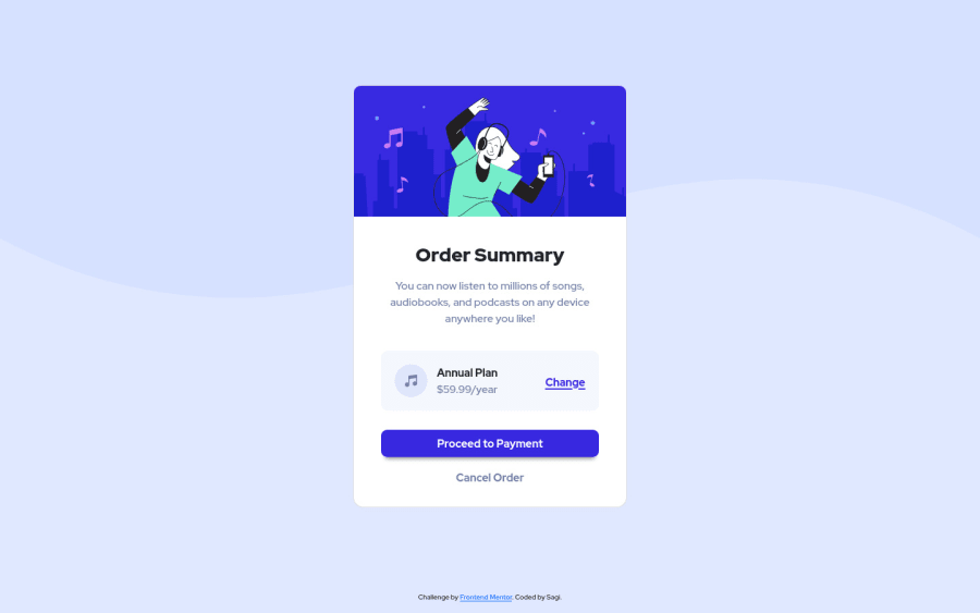
Design comparison
Solution retrospective
Hey. This is my first project. I would like to hear from you any comments - about the length, the language, and anything else.
-
How do i make the bottom link to be under the card? when im watching my site it's perfect, but the screenshot showing another picture.
-
there is Translator add-on on my chrome, which making my content looks wrong, and the challnge fixed only when I disabled the add-on. Is there any solution?
Im hungry to learn, so thank u!
Community feedback
- @MatzeW95Posted almost 3 years ago
To the first point. You have to place the whole "<div class="link">"(Line 50-52) behind the "div" in line 54, But before the </body> in line 55.
Sry but i cant help you with your second problem.
0@SagiMaimoniPosted almost 3 years ago@MatzeW95 thank u. I tried that before, but that solution makes the bottom line to be at the middle-right side of the screen, which is worst.
what am I do wrong?
0@MatzeW95Posted almost 3 years ago@SagiMaimoni the problem is that you set your "body" to "display: flex". In default that means your objects will be placed in a row. But in this case we want to have it below each other, so you need to add "flex-direction: column;" to your "body".
Marked as helpful1
Please log in to post a comment
Log in with GitHubJoin our Discord community
Join thousands of Frontend Mentor community members taking the challenges, sharing resources, helping each other, and chatting about all things front-end!
Join our Discord
