Not Found
Not Found
Not Found
Not Found
Not Found
Not Found
Not Found
Not Found
Not Found
Not Found
Not Found
Not Found
Not Found
Not Found
Not Found
Not Found
Not Found
Not Found
Not Found
Not Found

Submitted

First Challenge: Social Links Profile

@KapteynUniverse

Desktop design screenshot for the Social links profile coding challenge

This is a solution for...

  • HTML
  • CSS
1newbie
View challenge

Design comparison


SolutionDesign

Solution retrospective


What specific areas of your project would you like help with?

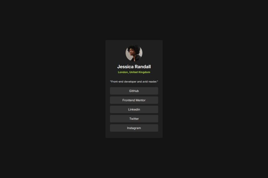
For some reason, I couldn't adjust the height of the card div. It was responding to the size of its child elements, so I changed 'Front-end developer and avid reader' slightly. Because of the start and end of the sentence now align better with the buttons, I think it looks better.

Community feedback

P
Steven Stroud 4,480

@Stroudy

Posted

Amazing job with this! You’re making fantastic progress. Here are some small tweaks that might take your solution to the next level…

  • Your Main element styles are not doing anything because your body styles are centering the social card,
main {
    /* height: 100%; */
    /* width: 100%; */
    /* display: flex; */
    /* justify-content: center; */
    /* align-items: center; */
}
  • This does not matter that much at this stage but something to be mindful of for SEO(Search Engine Optimisation), <meta> description tag missing that helps search engine determine what the page is about, Something like this <meta name="description" content="" />

  • Using max-width: 100% or min-width: 100% is more responsive than just width: 100% because they allow elements to adjust better to different screen sizes. To learn more, check out this article: responsive-meaning.

  • Developers should avoid using pixels (px) because they are a fixed size and don't scale well on different devices. Instead, use rem or em, which are relative units that adjust based on user settings, making your design more flexible, responsive, and accessible. For more information check out this, Why font-size must NEVER be in pixels or this video by Kevin Powell CSS em and rem explained.- Another great resource for px to rem converter.

  • Using rem or em units in @media queries is better than px because they are relative units that adapt to user settings, like their preferred font size. This makes your design more responsive and accessible, ensuring it looks good on different devices and respects user preferences.

You’re doing fantastic! I hope these tips help you as you continue your coding journey. Stay curious and keep experimenting—every challenge is an opportunity to learn. Have fun, and keep coding with confidence! 🌟

Marked as helpful

0

Please log in to post a comment

Log in with GitHub
Discord logo

Join our Discord community

Join thousands of Frontend Mentor community members taking the challenges, sharing resources, helping each other, and chatting about all things front-end!

Join our Discord