Submitted over 2 years ago
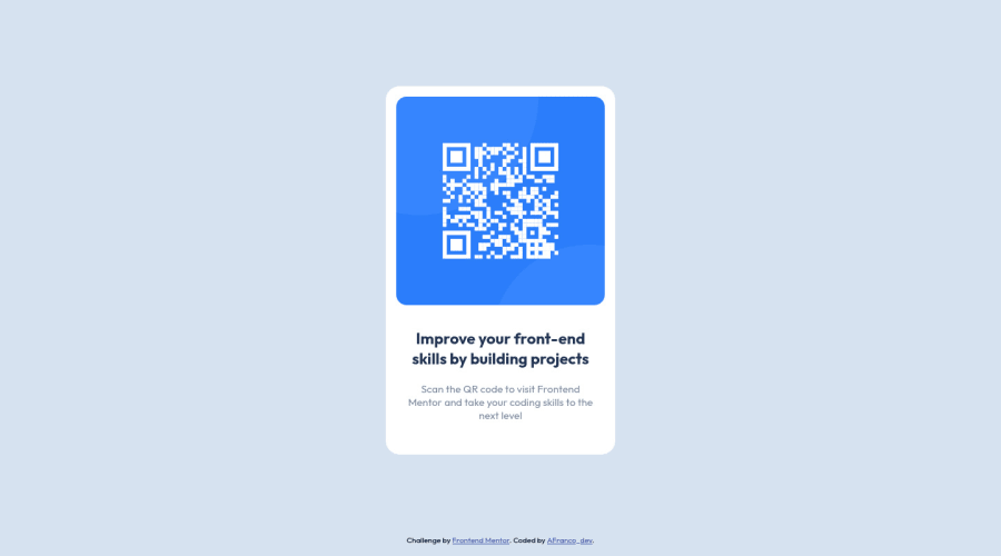
FIRST CHALLENGE QR code with pure CSS using flexbox
@AFranco-dev
Design comparison
SolutionDesign
Solution retrospective
Should I try to do this with bootstrap? Did I do a bad practice?
Community feedback
- @MrEasty94Posted over 2 years ago
Hey Andre, great job.... here's some feedback...
- I think you could use a <main> tag to wrap the card, I think this would be semantically correct.
- I think the 'attribution' section could be in a <footer> tag, again I think this would be semantically correct.
- For this, and future challenges, I would recommend setting your box-sizing to border-box. This makes calculating widths, heights, paddings, etc... a lot easier moving forward. One common way to do this is in your CSS, doing the following:
*, *::after, *::before { box-sizing: border-box; }
This sets all elements, including the after and before psuedo elements to the border-box model.
Great effort and keep going! :)
Marked as helpful1@AFranco-devPosted over 2 years ago@MrEasty94 thank you a lot for the feedback! I will apply what you said on my next challenge :) the last one will be really useful :D
0
Please log in to post a comment
Log in with GitHubJoin our Discord community
Join thousands of Frontend Mentor community members taking the challenges, sharing resources, helping each other, and chatting about all things front-end!
Join our Discord
