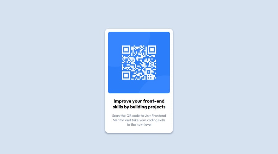
Design comparison
Solution retrospective
I am proud i started this path to be better at coding. Next time i will consider using flexbox or grid to space items.
What challenges did you encounter, and how did you overcome them?Trying to copy spacing, margin and padding from a screenshot is difficult. while playing and testing with the spacing i learned better how they work.
What specific areas of your project would you like help with?I would like feedback on my way of coding. Should i go mobile first? Should i use flexbox or grid? How do i name my classes and id's?
It would be optimal to have good habits when starting to learn these things.
Community feedback
- P@danielmrz-devPosted about 1 year ago
Hello, @vonsacker!
Your project is looking fantastic!
I'd like to suggest a way to make it even better:
- Using
marginisn't always the most effective method for centering an element.
Here's a highly efficient approach to position an element at the center of the page both vertically and horizontally:
📌 Apply this CSS to the body (avoid using
positionormarginsin order to work correctly):body { min-height: 100vh; display: flex; justify-content: center; align-items: center; }About using flexbox or grid:
📌 Use flexbox when you need a one-dimensional layout (either in a row or a column), such as navigation menus or arranging items within a container.
📌Use CSS grid when you need a two-dimensional layout with rows and columns, like organizing content in a grid-like structure or creating complex layouts.
In simple terms, use flexbox for simpler, linear layouts and CSS grid for more complex, grid-based layouts.
I hope you find this helpful!
Keep up the excellent work!
Marked as helpful1 - Using
- P@huyphan2210Posted about 1 year ago
Hi vonsacker,
If this is the first front end challenge you've ever done, good job.
I want to make some suggestions:
Make the body css like this:
body {
min-height: 100vh; // Make the body at least fills the whole page
margin: 0; // Remove the default margin of the body
// Other values here
}
Then you can use flexbox or grid to make the card in the center.
And if you can, use as less fixed numbers (like 300px, 480px, etc.) as possible. Try to play with percentage. Devices have different widths, so I think this is a better way
Marked as helpful1
Please log in to post a comment
Log in with GitHubJoin our Discord community
Join thousands of Frontend Mentor community members taking the challenges, sharing resources, helping each other, and chatting about all things front-end!
Join our Discord
