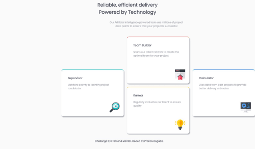
Submitted about 6 years agoA solution to the Four card feature section challenge
First challenge on Frontend monitor
@pranavbegade

Solution retrospective
It was really interesting working on this.
While setting up cards, I got confused while using flex, do you think I could have done with the display: inline-block; ?
please suggest which one is to use
Code
Loading...
Please log in to post a comment
Log in with GitHubCommunity feedback
No feedback yet. Be the first to give feedback on pranavbegade's solution.
Join our Discord community
Join thousands of Frontend Mentor community members taking the challenges, sharing resources, helping each other, and chatting about all things front-end!
Join our Discord