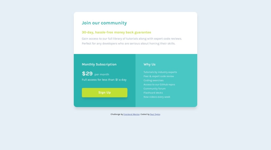
Design comparison
Solution retrospective
I started learning due to the lock down following a course or 2 on udemy.
This is my first challenge on Frontend Mentor so any feedback would be good.
I had to focus quite a lot on learning css grid and making the design responsive to complete the challenge.
I'm still unsure on text scaling and how that works with responsive designs so any insight would be good.
Many thanks,
Community feedback
- @edburtnieks-privatePosted over 4 years ago
Hey Paul :)
Your solution looks great! After a quick look, I found couple small things.
I noticed that you have headings
h3being smallest andh5being largest. I don't think in this design there is need for more than 1 or maximum two headings -h3(h4). Generally, you shouldn't chose headings based on their style (color, size, weight). Now, in design you come that across quite often, but not always. I think in this case it makes more sense to stick just with singleh2element, one for each section inside the card.From you CSS file.
Just an opinion, but if you put color values inside css variables, I think it would make sense to make white color a variable too. For example
line 72, you have#ffffffas color value. I would put it up with the rest of color variables at the top.I noticed you removed
outlineforbuttonelement. In general you want to avoid that. Or if you do removeoutline, then add some styles inside:focusselector forbutton. That way if you are using keyboard to tab through your page, user will know when their focus is on the button.For some reason you have two
box-shadowproperties inside.containerselector.line 33is overwritten withline 38.You could simplify your layout and reduce CSS file by applying mobile first approach. That is, keep all the card sections
display: block;as they are by default because ofdivelements. They will naturally by default stack on top of each other. And then you can apply grid only inside media query on larger screens, where you need it. Note that you would need to changemax-widthtomin-widthinside your media query.Answering your question about responsive text scaling. You have couple options. You can simple change the
font-sizeproperty inside your media query. That's probably the easiest, simplest and most predictable way. Almost always I do it this way.You could also look up some fluid font size scaling with % units. I haven't used fluid scaling much, but it has some uses, depending on how you want your responsive design to work.
I hope I cleared up some things. If you have any questions, feel free to ask here or on Slack.
Nice work, keep it up! :)
1@PaulyTeePosted over 4 years ago@edburtnieks
Really appreciate you taking the time to make such a detailed response and found all your points helpful, especially about the button outline.
I have taken your advice on board and have edited the CSS file to show this. Unsure about why I shouldn't use headings based on their styles as they then require less formatting in the css file later?
How else could I simplify my CSS layout?
I took your suggestion on-board building mobile first and put it into practice on the "four card feature section" challenge which I have just submited.
https://www.frontendmentor.io/solutions/built-mobile-first-with-some-media-queries-htmlcssgrid-and-flexbox-TNiybi6X8
Thanks again,
0@edburtnieks-privatePosted over 4 years ago@PaulyTee
Glad it was helpful for you!
Talking about heading usage with
h1-h6tags. They are what is called semantic tags. Meaning that their main purpose is to provide better accessibility for assistive technologies (e.g. screen readers)From Google Developers Accessibility guide, the very firt key point describes exactly that :) https://developers.google.com/web/fundamentals/accessibility/how-to-review#key_points_4
0
Please log in to post a comment
Log in with GitHubJoin our Discord community
Join thousands of Frontend Mentor community members taking the challenges, sharing resources, helping each other, and chatting about all things front-end!
Join our Discord
