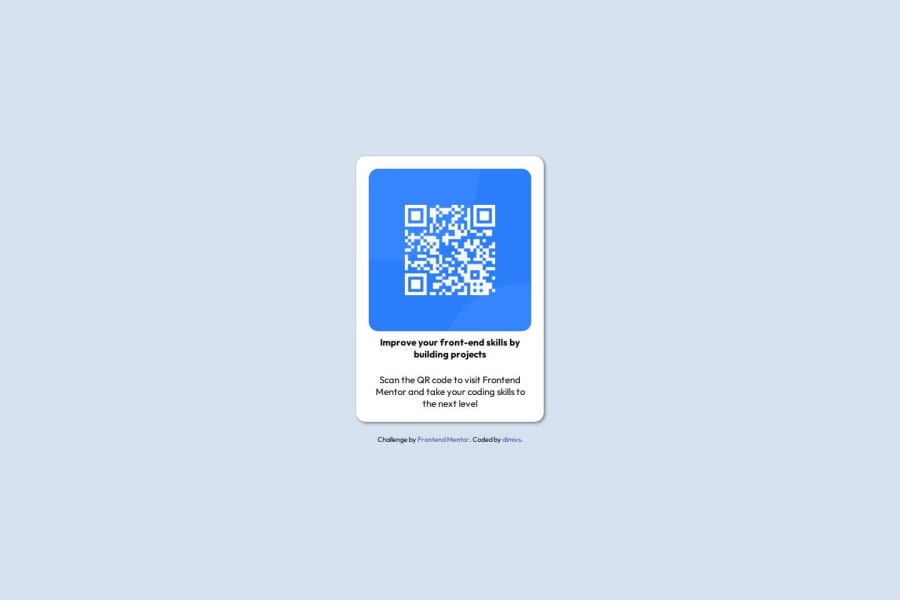
Design comparison
Solution retrospective
most proud: finishing it. what would do differently: start sooner.
What challenges did you encounter, and how did you overcome them?i could not centralize the qr code container with flex box, because i was not setting the height of the body element. Once it was set worked just fine.
What specific areas of your project would you like help with?all of it.
Community feedback
- @Islandstone89Posted 10 days ago
HTML:
-
<main>holds all of the main content on a page. As a card would likely not be the only component on a page, I would wrap the card content in a<div class="card">inside of<main>. -
The alt text must also say where it leads(the frontendmentor website). A good alt text would be "QR code leading to the Frontend Mentor website."
-
I would change the heading to a
<h2>- a page should only have one<h1>, reserved for the main heading. As this is a card heading, it would likely not be the main heading on a page with several components. -
Do not use
<br>to force text onto a new line. The text should flow naturally, and all styling, including space between elements, should be done in the CSS. -
Tags are written in lowercase letters, so change
<P>/P>to<p></p>. -
Wrap the footer text in a
<p>.
CSS:
-
It is best practice to write CSS in a separate file, often called
style.css. Create one in the same folder as theindex.html, and link to it in the<head>:<link rel="stylesheet" href="style.css">. -
Including a CSS Reset at the top is good practice.
-
Use the style guide to find the correct
font-familyand the correctbackground-color. Also remember to specify a fallback font:font-family: 'Outfit',sans-serif; -
I recommend adding a bit of
padding, for example16px, on thebody, to ensure the card doesn't touch the edges on small screens. -
On the
body, changeheighttomin-height: 100svh- this way, the content will not get cut off if it grows beneath the viewport. Removebackground-image, you should usebackground-color. -
Whenever the value is zero, you don't need to include the unit -
padding: 0pxandmargin: 0pxcan be writtenpadding: 0andmargin: 0. -
Remove all widths. It's not recommended to set fixed sizes, as it prevents components from growing and shrinking with the screen.
-
max-widthon the card should be in rem. Around20rem(equals320pxwill work fine. -
font-sizemust never be in px. This is a big accessibility issue, as it prevents the font size from scaling with the user's default setting in the browser. Use rem instead. -
Since all of the text should be centered, you only need to set
text-align: centeron the body, and remove it elsewhere. The children will inherit the value. -
On the image, add
display: block,height: autoandmax-width: 100%- the max-width prevents it from overflowing its container. Without this, an image would overflow if its intrinsic size is wider than the container.max-width: 100%makes the image shrink to fit inside its container.
Marked as helpful0@dimivsPosted 8 days ago@Islandstone89 this coment alone could be added has a extra step on the learnin path. Thanks a lot!
1 -
Please log in to post a comment
Log in with GitHubJoin our Discord community
Join thousands of Frontend Mentor community members taking the challenges, sharing resources, helping each other, and chatting about all things front-end!
Join our Discord
