Design comparison
SolutionDesign
Solution retrospective
i will be appreciate for any feedback
Community feedback
- @Nova988Posted about 3 years ago
Hello,
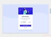
Nice card just a few things you could change:
- The background-color needs to be a different color.
- Try to add some vertical padding on the Proceed payment button to match the design.
Hope it helps!
Marked as helpful0
Please log in to post a comment
Log in with GitHubJoin our Discord community
Join thousands of Frontend Mentor community members taking the challenges, sharing resources, helping each other, and chatting about all things front-end!
Join our Discord

