Not Found
Not Found
Not Found
Not Found
Not Found
Not Found
Not Found
Not Found
Not Found
Not Found
Not Found
Not Found
Not Found
Not Found
Not Found
Not Found
Not Found
Not Found
Not Found
Not Found

Submitted

First Attempt - Product Preview

Trevor 200

@Tactenator

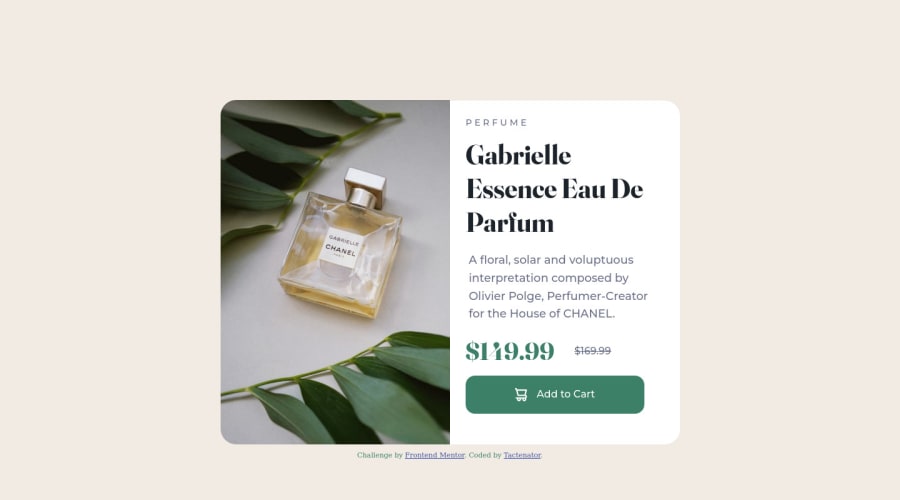
Desktop design screenshot for the Product preview card component coding challenge

This is a solution for...

  • HTML
  • CSS
1newbie
View challenge

Design comparison


SolutionDesign

Solution retrospective


  1. Is there another way I could've lined up the image and the description other than flex?

  2. When reducing the size of the window, I noticed that the text will push the price and the button outside of the div. How would I go about making sure that doesn't happen?

Any other tips and tricks are greatly appreciated and welcome. Thank you very much!

Community feedback

@lifeaddikt

Posted

Hello,

First of all congratulations, really nice job :)

I'm a beginner too but i can try to answer your questions.

  1. Yes you can also do it with grid. But flex works well here. (and maybe with a display inline?? dont know not a good practice i guess)

  2. The button goes outside the div cause of your max-height. Try to change your breakpoint to keep the same properties and cancel this behaviour or add another breakpoint with another max-height.

Bye !

Marked as helpful

1

Trevor 200

@Tactenator

Posted

@lifeaddikt

Hello, Victor!

Thank you very much! :)

I will definitely be trying the grid trick! As for the button, I will give that a whirl as well and see what I come up.

Thank you very much for the help! :)

Take care!

0
Lucas 👾 104,420

@correlucas

Posted

Hello Trevor, congratulations for your solution!

Answering your question:

Another alternative to create this component, is using grid is even more simple than with flexbox.

To build the component with 2 columns you can use max-width: 900px for the container size and display: flex and grid-template-column: 1fr 1fr for the layout this way you'll have the layout done. And the two divs inside will have 50% the parent size. To manage the column with text content use flex.

To avoid the pricing section poping out of the container create a media query changing the price section flex-direction: column to have one text below the other.

Hope it helps and happy coding! 👏

Marked as helpful

1

Trevor 200

@Tactenator

Posted

@correlucas Hello again, Lucas! :)

Ahhhh that's a neat trick with grid. I didn't even think about that. I'm going to definitely give that a try. As for the flex direction, I'll give that a try too and see how it goes.

Thank you again for the sage wisdom. It truly does help!

Take care!

0

Please log in to post a comment

Log in with GitHub
Discord logo

Join our Discord community

Join thousands of Frontend Mentor community members taking the challenges, sharing resources, helping each other, and chatting about all things front-end!

Join our Discord