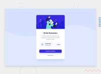
Design comparison
SolutionDesign
Solution retrospective
Thanks for passing by!
Please dont forget to leave a feedback of my project, thats how I will get better!
:)
Community feedback
- @darryncodesPosted about 3 years ago
Hi Raul,
Good effort, a really close match to the design:
Try the following to adjust the background and center things nicely in the viewport:
body
    background: url(../images/pattern-background-desktop.svg);
    background-size: 100% auto;
    background-repeat: no-repeat;
    background-attachment: fixed background-repeat: no-repeat;
    background-color: hsl(225, 100%, 94%);
.container min-height: 100vh; display: flex; justify-content: center; align-items: center;Marked as helpful0
Please log in to post a comment
Log in with GitHubJoin our Discord community
Join thousands of Frontend Mentor community members taking the challenges, sharing resources, helping each other, and chatting about all things front-end!
Join our Discord

