Design comparison
SolutionDesign
Solution retrospective
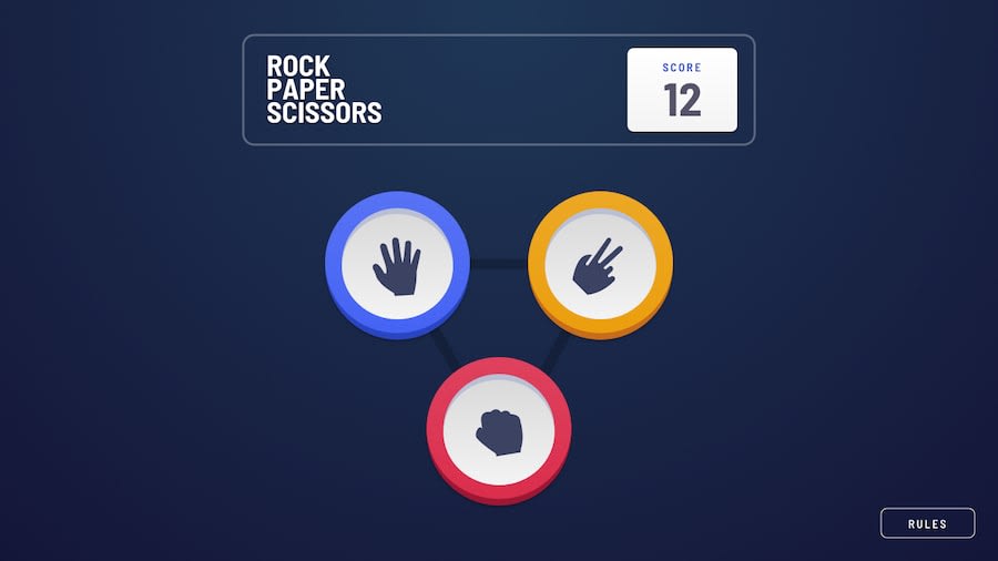
Hey everyone! This is my first advanced challenge submission. I think there are a few improvements to be made but overall I'm happy with what I have so far. Please let me know what you think!
I really like how the rock, paper, scissors buttons were designed. It took me awhile to create them myself and I learned a lot from those alone.
One more thing: I had to learn how to center overflow text on a single line. I forgot the stack overflow thread but this was the solution.
// TailwindCSS
<p className="text-center -ml-[100%] -mr-[100%]">Centered text</p>

// CSS
text-align: center;
margin-left: -100%;
margin-right: -100%;
Community feedback
Please log in to post a comment
Log in with GitHubJoin our Discord community
Join thousands of Frontend Mentor community members taking the challenges, sharing resources, helping each other, and chatting about all things front-end!
Join our Discord
