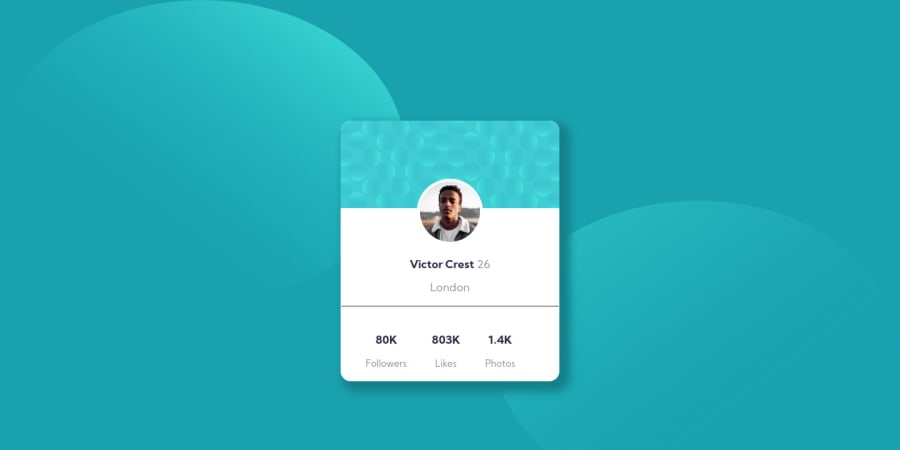
Design comparison
Solution retrospective
Phew!!! Oh man, finally finished my first ever challenge on my own. It looks very simple but I got kicked in my gut while doing this project. I have learned so many things both coding and non coding wise, I can't wait to finish another one.
Your inputs are most welcome. Feel free to point out how or where I can make this better.
Thank you
Please log in to post a comment
Log in with GitHubCommunity feedback
- @grace-snow
Hi,
This looks pretty good, you should be pleased with it. And you are right this challenge is a lot harder than it looks!
A few points for you
- only meaningful images need alt descriptions. Decorative images like the pattern at the top of the card should have empty alt attributes like
alt=""so assistive technology knows not to announce them. - the hr you've used doesn't quite look the right color or thickness maybe. You could use a border bottom/top instead of the HR
- the stats at the bottom need to be dead with the numbers and words together, and words like 'followers' aren't supplementary. They are core to to the meaning, so shouldn't be inside small tags. It would be better if these number-word pairs were in one paragraph together, with spans wrapping each part for styling. Or, you could probably use description-list elements which are well suited for this kind of content.
- with css try to use classes, not ids for styling. IDs are a bad habit to get into for styling or javascript hooks, so best not to form that habit now. Keep specificity nice and low in your css by using single class selectors, that's what they are there for.
Final recommendation is to take another look at your background images (those Circles). They are looking stretched/squished at most screen sizes.
Keep on coding! Hope this all helps.
- only meaningful images need alt descriptions. Decorative images like the pattern at the top of the card should have empty alt attributes like
- @kotesh-arya
hey mate, that looks pretty good but while viewing it in mobile those bubbles are getting combined with each other . Do check it once, rest are perfect 👍🏼
Join our Discord community
Join thousands of Frontend Mentor community members taking the challenges, sharing resources, helping each other, and chatting about all things front-end!
Join our Discord
