Design comparison
SolutionDesign
Solution retrospective
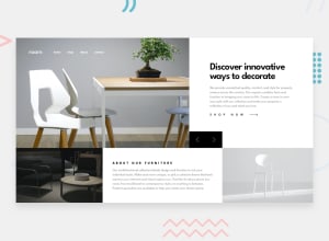
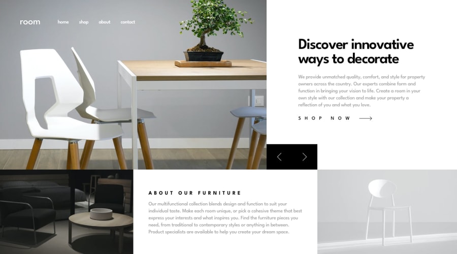
Hello everyone, I am late with my 3-day submission but it finally has done I know there is some problem with it. I am using the grid lately because of that I am really struggling with it. Any feedback or suggestion for the improvement would be appreciated.
Community feedback
- @ApplePieGiraffePosted about 4 years ago
Hey, Sourabh Singh! 👋
Good work on this challenge! 👍
I think,
- It would be easier if you created a grid with a single grid area for each block of the page. For example, I think you could recreate the layout of the design with just two rows and four or five columns or so. Just make sure you give each of the columns the correct size and place each (image/text) block in its appropriate grid area.
- The header navigation gets pushed off the screen when the width of the viewport decreases in the mobile layout of the page. Perhaps decrease the space between each navigation link so that they all fit within in the viewport (or better yet, use flexbox to equally distribute the available space).
Keep coding (and happy coding, too)! 😁
0@6ixlinePosted about 4 years ago@ApplePieGiraffe Thank you for the suggestion. As I say in my question I haven't used a grid before that why I wasn't really comfortable with it 😩. I will work on that.
0
Please log in to post a comment
Log in with GitHubJoin our Discord community
Join thousands of Frontend Mentor community members taking the challenges, sharing resources, helping each other, and chatting about all things front-end!
Join our Discord
