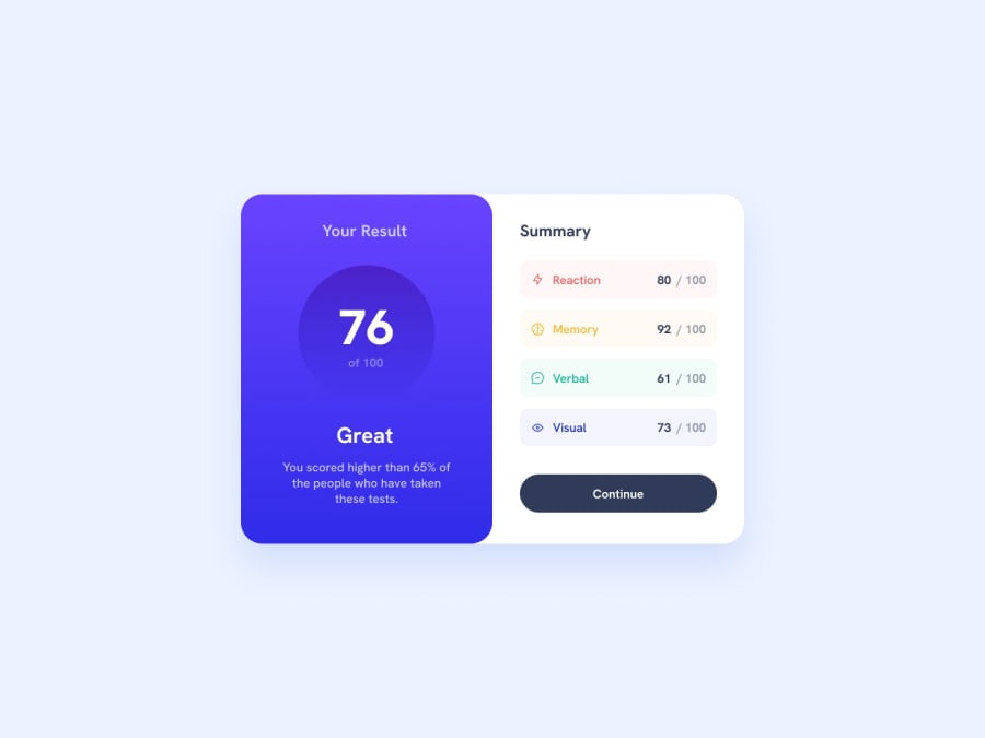
Design comparison
SolutionDesign
Solution retrospective
I'd like to improve when changing from desktop to mobile because the wrapping is not as smooth as I whished. The help would be very helpful for me
Community feedback
Please log in to post a comment
Log in with GitHubJoin our Discord community
Join thousands of Frontend Mentor community members taking the challenges, sharing resources, helping each other, and chatting about all things front-end!
Join our Discord

