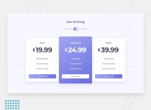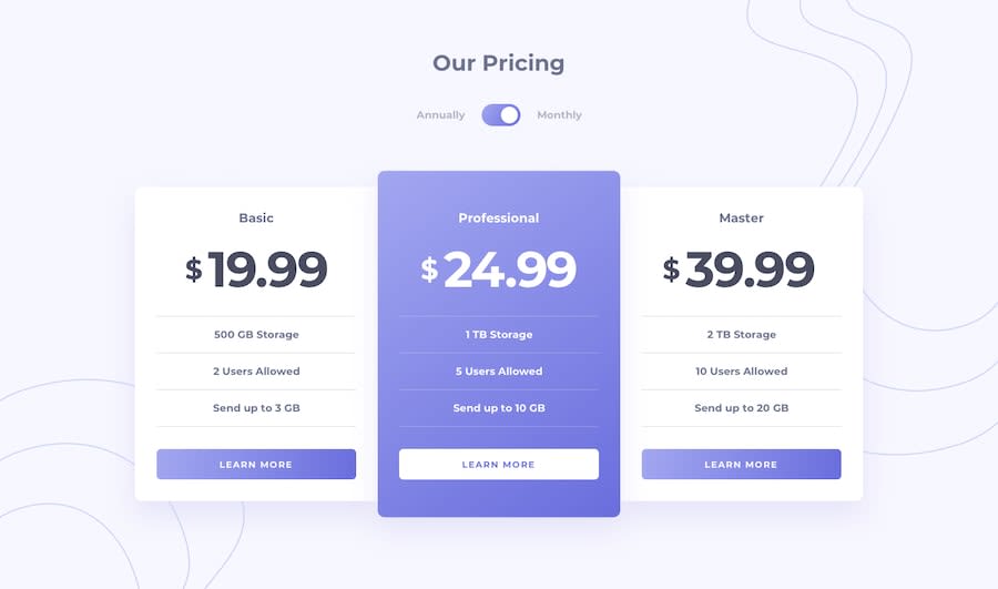
Design comparison
SolutionDesign
Solution retrospective
Done :D This challenge was cool and I tried to do my best Any feedback is welcome
Community feedback
- @ApplePieGiraffePosted almost 4 years ago
Hey, once again, Aaron Gonzalez! 👋
Well done on this challenge! 👍 Your solution looks good and the toggle-switch works well! 👏
A few things I'd like to suggest are,
- Adding
cursor: pointerto the buttons. - Adding an outline to the toggle-switch so that keyboard users can easily tell when it is tabbed to.
- Adding some space between the cards and the bottom of the page (using margin/padding) so that there's always some room between the two in the desktop layout.
As usual, keep coding (and happy coding, too)! 😁
1 - Adding
Please log in to post a comment
Log in with GitHubJoin our Discord community
Join thousands of Frontend Mentor community members taking the challenges, sharing resources, helping each other, and chatting about all things front-end!
Join our Discord
