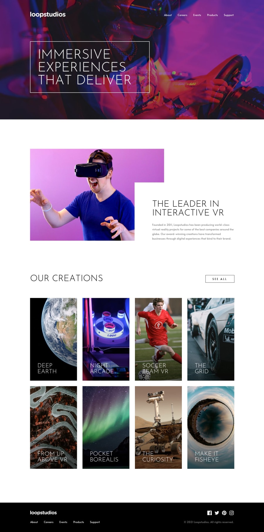
Design comparison
Solution retrospective
I think that I've done my job well. Waitin for reply :)
Community feedback
- @ApplePieGiraffePosted almost 4 years ago
Hey, DG00! 👋
Congratulations on completing your first Frontend Mentor challenge! 🎉 Good work on this one! 👍
A few things I suggest are,
- Adding
cursor: pointerto the cards in the "Creations" section. - Making sure the hover effect for the cards in the "Creations" section remains visible when the titles of the cards are hovered over.
- Adding some more space between the navigation links in the logo of the page in the mobile menu.
You can make the background of the hero section darker by adding a linear-gradient to the background of that section and setting both of its colors to black (with some opacity in it, so that the background image remains visible).
Hope that helps. 😀
Keep coding (and happy coding, too)! 😁
1 - Adding
- @RocTanweerPosted almost 4 years ago
Never settle! Your font size are way different than the design and header or hero image should be a bit darker
hope it helps
1@dgebara00Posted almost 4 years ago@RocTanweer Thanks a lot for comment. You motivated me to improve that and I think it's way better now but still dunno how to make background darker.
0
Please log in to post a comment
Log in with GitHubJoin our Discord community
Join thousands of Frontend Mentor community members taking the challenges, sharing resources, helping each other, and chatting about all things front-end!
Join our Discord
