


Design comparison

Solution retrospective
What are you most proud of, and what would you do differently next time?
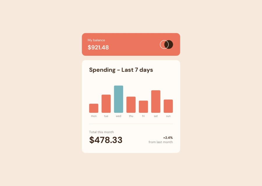
In this challenge, one of the key things I learned was how to create dynamic charts and data visualizations using a combination of CSS and JavaScript.
On the CSS side, I likely explored techniques for building the basic chart structure, such as:
- Using
divandspanelements to represent the chart bars, labels, or other visual components. - Applying styles like
width,height,background-color,border-radius, etc. to shape and style the chart elements. - Leveraging CSS positioning and layout properties to arrange the chart components properly.
- Potentially using CSS animations or transitions to add interactivity and transitions to the chart.
Then, on the JavaScript side, I was able to take this static chart structure and make it dynamic by:
- Selecting the relevant chart elements using DOM manipulation methods.
- Updating the styles of these elements programmatically, such as changing the
widthorheightproperties to reflect changing data. - Potentially hooking into user events like clicks or hovers to trigger more advanced chart interactions.
- Using JavaScript to fetch data from source, and then updating the chart in real-time to visualize the data.
What specific areas of your project would you like help with?
Any feedback is appreciated
Community feedback
Please log in to post a comment
Log in with GitHub
Join our Discord community
Join thousands of Frontend Mentor community members taking the challenges, sharing resources, helping each other, and chatting about all things front-end!
Join our Discord