Design comparison
Solution retrospective
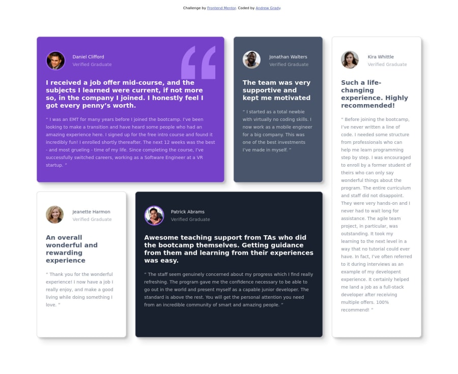
This was my first actual attempt at utilizing grids. I could not believe how easy they were to set up.
...That being said, I could not figure out how to make them responsive. I believe I got too deep into my code before realizing I needed to reformat my grids in order to make them responsive and right now I just do not have the time. I will either go back and fix this or practice on another project in the near future!
(also just realizing sizing may be a bit off, but the scale appears to be just fine)
Let me know what you see and how I can improve!
Please log in to post a comment
Log in with GitHubCommunity feedback
No feedback yet. Be the first to give feedback on Andrew Grady's solution.
Join our Discord community
Join thousands of Frontend Mentor community members taking the challenges, sharing resources, helping each other, and chatting about all things front-end!
Join our Discord
