Submitted almost 3 years agoA solution to the News homepage challenge
FEM's News Homepage - my take on it.
@kwngptrl

Solution retrospective
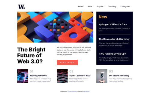
Hi, this is my take on this challenge. Feedback is welcome. While the navbar is working, I'm not fully satisfied with it. It doesn't seem to be obeying grid rules in some cases, like there's quite a bit of padding when on fullscreen mode.
Code
Loading...
Please log in to post a comment
Log in with GitHubCommunity feedback
No feedback yet. Be the first to give feedback on wannacode's solution.
Join our Discord community
Join thousands of Frontend Mentor community members taking the challenges, sharing resources, helping each other, and chatting about all things front-end!
Join our Discord