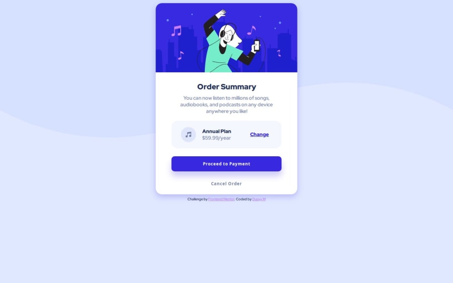
Design comparison
Solution retrospective
hi, I present my solution, can you help me improve with your comments, thanks
Community feedback
- @pikapikamartPosted about 3 years ago
Hey, awesome work on this one. Layout in general looks great and it is responsive.
kens_visuals already gave great tips on this one, just going to add some suggestions as well:
- The vector image is just a decoration so you can hide it. Decorative image must be hidden at all times by using
alt=""and extraaria-hidden="true"attribute on theimgtag. - Same goes for the music-icon, it is only decorative.
- Also when using
altattribute, avoid using words that relates to "graphic" such as "icon" and others. Animgis already an image/graphic so no need to describe it as one.
Just those ones, to be honest this is a really great site. Markup looks great just the images.
Marked as helpful0 - The vector image is just a decoration so you can hide it. Decorative image must be hidden at all times by using
- @kens-visualsPosted about 3 years ago
Hey @dusvimarin 👋🏻
I just have some quick tips for the project 🙃
- Since you already have
transitionfor the button, I'd recommend adding it to the.links as well. - Also, for the music icon, add
aria-hidden="true", because it's for decoration. You can read more about aria-hidden here.
I hope this was helpful 👨🏻💻 congrats on the first project. You did a great job, well done. Cheers 👾
Marked as helpful0 - Since you already have
- @dovelmPosted about 3 years ago
Raymart, thanks, thanks!!! and you're right about the names of images ... I did not know how to name it!!! ☺️
1
Please log in to post a comment
Log in with GitHubJoin our Discord community
Join thousands of Frontend Mentor community members taking the challenges, sharing resources, helping each other, and chatting about all things front-end!
Join our Discord
