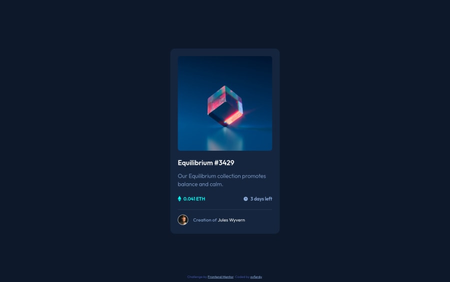
fem-nft-preview-card-component
Design comparison
Solution retrospective
feedback are highly appreciated 👍
Community feedback
- @CrowdedAstronautPosted over 3 years ago
Wow,
Nice use of SASS. Your solution is almost pixel-perfect!! 🙌. I'd like to see a more extensive README.md, but this is very impressive.
0@xvferdyPosted over 3 years ago@CrowdedAstronaut hahaha... one day I was working on a take home coding challenges, and I failed 😭, they said the design should be ~90% pixel perfect, LOL.
Becuz of that, whenever I practice some front-end coding I always try to make the website similar like the design as possible 👍
0@CrowdedAstronautPosted over 3 years ago@xvferdy I’ve experienced the same thing!! That’s why I’m practicing my skills here. Really nice solution. 🙌
0 - @Renato6GSPosted over 3 years ago
Hi!
Very well done 😀
Maybe, you may fix a responsive problem, but the "card" from an "IPad Pro" is too small.
0@xvferdyPosted over 3 years ago@Renato6GS Hey thx for the feedback I really appreciate that. I will do that next time 👍
0
Please log in to post a comment
Log in with GitHubJoin our Discord community
Join thousands of Frontend Mentor community members taking the challenges, sharing resources, helping each other, and chatting about all things front-end!
Join our Discord
