Design comparison
Solution retrospective
This is my 5th or 6th Front End Mentor Challenge, I am about 6 weeks into learning to use HTML/CSS, and I can say I am very happy with the outcome of this challenge!
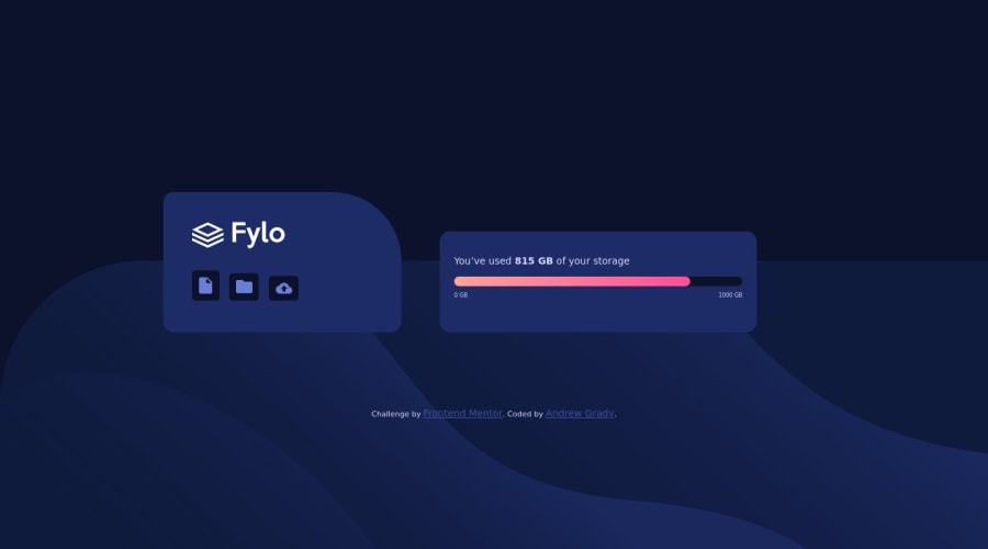
I had grown comfortable with HTML and was ready to challenge my CSS skills by simplifying my code a little and starting to spice things up by adding animations. Needless to say. a loading bar was a little troublesome, but after hours upon hours of trying to create a counter using only CSS, I figured it was going to be extremely difficult without using some form of JS.
Some people had commented on a previous challenge of mine where nothing seemed to be loading correctly from my local site to Github and I was finally able to straighten that up as well!
Main issue I was having was spacing the parent divs to center my containers, and then not being able to get my icons to all be the same size as well as centered. I'm ok with the outcome, but will eventually need to figure that out if I plan on doing this as a real job.
As always, all critiques and comments are welcome! Thank you for the continued help!
Please log in to post a comment
Log in with GitHubCommunity feedback
No feedback yet. Be the first to give feedback on Andrew Grady's solution.
Join our Discord community
Join thousands of Frontend Mentor community members taking the challenges, sharing resources, helping each other, and chatting about all things front-end!
Join our Discord
