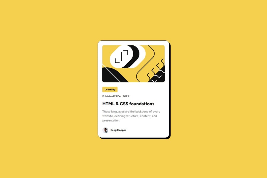
Design comparison
Solution retrospective
Hi there, I missed 1px from the image... It should be 200px but it is rendered as 201px. idk why, lol... I should work on the rendered images...
Community feedback
- P@danielmrz-devPosted about 1 year ago
Hello @adonmez04!
Your solution looks excelent!
I have just one suggestion:
- In order to make your HTML code more semantic, use
<h1>for the main title instead of<h3>. Unlike what most people think, it's not just about the size and weight of the text.
📌 The
<h1>to<h6>tags are used to define HTML headings.📌
<h1>defines the most important heading.📌
<h6>defines the least important heading.📌 Only use one
<h1>per page - this should represent the main heading/title for the whole page. And don't skip heading levels - start with<h1>, then use<h2>, and so on.This change has little or not effect at all on the project, but it makes your HTML code more semantic, improving SEO optimization as well as the accessibility of your project.
I hope it helps!
Other than that, you did a great job!
Marked as helpful0@JameRussell2010Posted about 1 year ago@danielmrz-dev Thank you for that extremely informative answer and reminder for us Daniel!
Marked as helpful1@adonmez04Posted about 1 year agoOh, hi @danielmrz-dev. Thanks for your feedback and kind words... Yes,
<h1>is required for each HTML file. I thought, this card is a component and it will be below the other HTML elements, and in this scenario<h1>element will already be in the document...So I avoid giving any<h1>or<h2>tag to the card component to not break the document hiearchy flow. But using<h1>for this project is absolutely no problem...1 - In order to make your HTML code more semantic, use
Please log in to post a comment
Log in with GitHubJoin our Discord community
Join thousands of Frontend Mentor community members taking the challenges, sharing resources, helping each other, and chatting about all things front-end!
Join our Discord
