Design comparison
Solution retrospective
Not my best work, I've been at it for a few days on and off. Life has been quite chaotic lately and every time I seem to open this project in specific I lost where I was last left at XD.
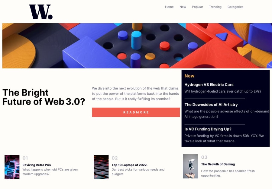
Problems I faced were : Grid spans, I noticed I need more practice using them in projects, I barely use grid as is lol. Another problem was remembering to build the desktop version while building the mobile version. Saves alot of time, more problems were spacing. I seem to have had quite a bit of overflow between the "3.0 textarea" and the bottom area. Moving forward will be aiming to put 110% into each and every project regardless of tiredness or willingness to code.
All Advice appreciated -
Community feedback
- @jairovgPosted over 1 year ago
Hi Huey.io, congrats on your solution; here are some comments that might help you to improve it:
Accessibility and semantics
- This is your heading map:
Tailwind News 3 - The Bright 3 - Hydrogen VS Electric Cars 3 - The Downsides of AI Artistry 3 - Is VC Funding Drying Up?
- All headings should have a hierarchy and also there are some missing ones. You can check this checklist provided by Deque University to know some best practices related to headings that will help you to improve your structure.
- All interactive elements, like anchors or buttons should provide different states to be universally accessible; those states should at least be
rest
(default state),hover
,focus
andactive
. Check for the requirements in the provided screenshots and try to not let the browser use thefocus
one to provide a unique experience across devices. - The solution lacks a lot of semantic elements that may enhance the meaning of your page and will play a key role in assistive technologies like screen readers. A sample is the elements in your
section#bottom
; the page islisting
in anordered
way different elements. Each repetitive element is required to be alink
to other pages. - You're opting to use decorative images in all sections. Think about if the image really adds a meaning to the content and if that's so, then add a descriptive
alt
text to it, otherwise, they will be treated as decorative only and will be ignored by assistive technologies like screen readers. - The Web Accessibility Checklist by Deque University, will help you to improve your page's semantic structure and enhance its accessibility also.
Other
- You're duplicating all the navigation elements to display desktop and mobile versions. It should be created as a single component changing its appearance using CSS only.
- The page does not have a limit which makes the elements expand to full width. Check on the provided screenshot to know the page
max-width
.
Regarding your questions/doubts
-
...problem was remembering to build the desktop version while building the mobile version.
As mentioned by Matias, think about components and try to make them look progressively good on mobile first and switch to desktop version; identifying the components first may prevent to inject issues like treating the hero image (image-web-3) as part of the hero component, which should be a
section
element, and realizing that it should not be above thenews
component, which should be anothersection
element of the page.-
Grid spans, I noticed I need more practice using them in projects...
Same as the above comment, think about components first and do not try to create a grid for all the page elements at once. You'll notice that this approach will allow you to reuse components in following challenges or projects.
There are also good resources out there that will help you improve your skills using grids, here are some of them:
- A Complete Guide to CSS Grid.
- Grid garden.
- Finally, I suggest you not try going to the next challenge without solving the issues in this challenge first. Give the 110% you mentioned improving this challenge to get to the next one with more skills and new approaches and practices to apply.
I hope you find it useful. I'm happy to look at your solution if you make other changes.
Marked as helpful1@huey-ioPosted over 1 year ago@jairovg I appreciate the insight. I will make the necessary changes you recommended my friend, thank you very much. This helps ALOT
0 - @matiasluduena23Posted over 1 year ago
Hi @huey-io! Good job. One thing that can be helpful when you're working on mobile first is to do it in sections. First test your header on both screen sizes, once you're done move on to the next one and so on. Works for me!
Good code!
Marked as helpful1
Please log in to post a comment
Log in with GitHubJoin our Discord community
Join thousands of Frontend Mentor community members taking the challenges, sharing resources, helping each other, and chatting about all things front-end!
Join our Discord