Feedback-app-MERN-tailwind
Design comparison
Solution retrospective
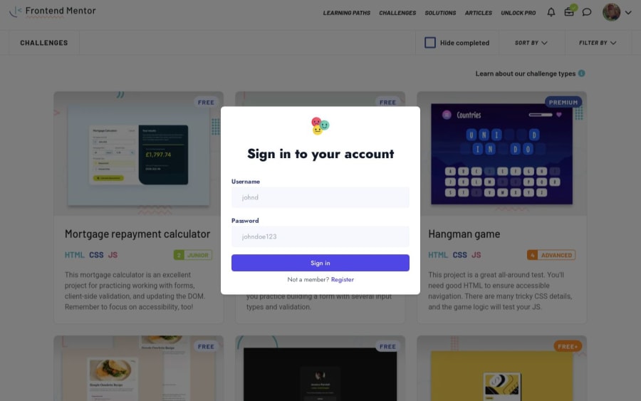
I'm most proud of designing my custom login page. In my eyes, it turned out well and reflects my effort in creating a user-friendly and visually appealing start. I still think that a plain background is better, but for a future idea I have in mind, a background is necessary. What are your thoughts on the contrasts?
What challenges did you encounter, and how did you overcome them?The biggest challenge I encountered was implementing mobile animations due to issues with initial scrolling caused by absolute div elements. Additionally, since this project is built on an older foundation, I had to address a lot of my 'old thinking,' which needed fixing. It was annoying and tedious to fix, but it was worth it. This is my favorite project so far.
What specific areas of your project would you like help with?I would appreciate feedback on all aspects of the project. Additionally, I'm open to suggestions for future improvements beyond the current assignment scope. Despite the repairs needed for broken CSS, this project was a fun journey.
Community feedback
Please log in to post a comment
Log in with GitHubJoin our Discord community
Join thousands of Frontend Mentor community members taking the challenges, sharing resources, helping each other, and chatting about all things front-end!
Join our Discord
