Design comparison
SolutionDesign
Community feedback
- @grace-snowPosted about 3 years ago
Hello
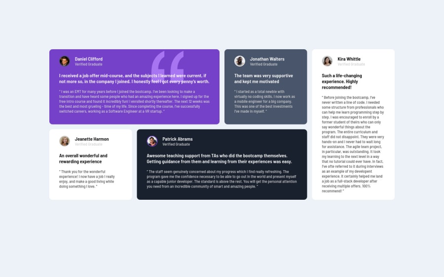
This looks good except there are box shadows missing and some of the writing is unreadably small for me (that may be the design, but I would challenge it if the design said to have text that small). I'm trying to read on mobile.
In the html there are some structural semantic issues
- make container a main element
- headings have to go in order and start at the highest level. Presuming this page of a real full webpage would already have a h1, so you would need to make h3s on peoples names into h2s
- the paragraphs that are part of the quotes do not make sense as heading elements at all. They are just paragraphs styled to look larger.
- similarly, if using blockquote, these paragraphs are part of the quote
- on the images "use profile" isn't a good description. They should say the person's name
- you could optionally consider using the figure element to wrap each box instead, which would allow you to put the person's name, img and status in a caption element. That's just an idea
- make sure no font sizes are ever in px, even on the body. Use rem.
I hope this is helpful
Marked as helpful0
Please log in to post a comment
Log in with GitHubJoin our Discord community
Join thousands of Frontend Mentor community members taking the challenges, sharing resources, helping each other, and chatting about all things front-end!
Join our Discord
