Not Found
Not Found
Not Found
Not Found
Not Found
Not Found
Not Found
Not Found
Not Found
Not Found
Not Found
Not Found
Not Found
Not Found
Not Found
Not Found
Not Found
Not Found
Not Found
Not Found

Submitted

Feature-Cards

@wojocode

Desktop design screenshot for the Four card feature section coding challenge

This is a solution for...

  • HTML
  • CSS
1newbie
View challenge

Design comparison


SolutionDesign

Solution retrospective


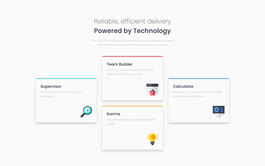
Hi, my first mobile-first design. I used flex-box technology. I tried to used align-self for first and last card to center it in the container but it didn't work and finally I positioned it by using transform translate Y 50%. Maybe you guys know how to do it, or this is only possible with grid ? cheers ! Wojtek

Community feedback

Abdullah 340

@ASH2001prince

Posted

Hello Wojtek Natkaniec congratulations for this project

  • I think you have a super responsive design here but I have something that I noticed like the main height if you remove the margin : 0 0; and add a padding : 20px the height of the page would be much better.
  • I`m not sure about this but I think working on the grid system here if easer I have done this project before and this is how I worked on the main container:
.cards{
    display: grid;
    grid-template-columns: repeat(4, auto);
    justify-content: center;
    align-items: center;
}

Hope you find it helpful

0

@AhmadHamido

Posted

Hello Wojtek. -First, I would like to tell you that you did a really good job with your layout. -Second, I don't know if you have studied grid yet or have enough knowledge about it, but I would recommend you doing the layout using grid, because first it would allow you to write way less code, and second, it would be easier to place stuff in your layout. -Third, I would do something like this:

.sub-container {
    max-width: 1000px;
    display: grid;
    grid-template: repeat(12, 30px) / repeat(3, 1fr);
    grid-column-gap: 20px;
  }

  .box-1 {
    grid-column: 1;
    grid-row: 5 / span 8;
  }

  .box-2 {
    grid-column: 2;
    grid-row: span 8;
  }

  .box-3 {
    grid-column: 2;
    grid-row: 9 / span 8;
  }

  .box-4 {
    grid-column: 3;
    grid-row: 5 / span 8;
  }

I hope this would help. Happy coding! :D

0

Please log in to post a comment

Log in with GitHub
Discord logo

Join our Discord community

Join thousands of Frontend Mentor community members taking the challenges, sharing resources, helping each other, and chatting about all things front-end!

Join our Discord