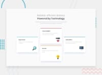
Design comparison
SolutionDesign
Solution retrospective
I'm starting to doing better. Thanks to the feedback I've got from previous challenges I see myself improving.
Keep it up everyone and happy coding.
Any feedback is welcome. :)
Community feedback
- @CarolineSenesPosted about 3 years ago
Hello Nicolas,
Here are some remarks to improve your solution: 1.The 2 lines of the <h1> must be aligned to the left and to the right. 2.The font must be Poppins.
Mobile version: 1.Margin is missing at the top and bottom of the screen. 2.The <p> under the <h1> is not aligned with this one.
Well done for your work! Good continuation !
Marked as helpful0
Please log in to post a comment
Log in with GitHubJoin our Discord community
Join thousands of Frontend Mentor community members taking the challenges, sharing resources, helping each other, and chatting about all things front-end!
Join our Discord

